
To receive emails from your favorite brands, you first need to subscribe to their newsletters. But where do we read them? Mostly on a computer or laptop screen. Except it's the 21st century: we're mobile, and besides laptops we also have smartphones and tablets.
According to data from Statista, 92.6% of internet users go online via mobile devices. That's exactly why correct email rendering across different devices instantly adds +50 points to a campaign's success. Let's talk about that.
In fact, we already touched on adaptation in the previous lesson when we studied stacking blocks — now we'll talk about other elements. But first, let's understand what kinds of screens exist.
Responsiveness and screen sizes
Responsiveness in email marketing refers to an email's ability to adjust to the screen width — so that the text stays readable and the images are an optimal size.
This approach to markup is also called fluid layout. The idea is that the developer sets the size of each block in percentages instead of pixels. As a result, fluid layout adapts to different screens, and reading is comfortable for everyone.
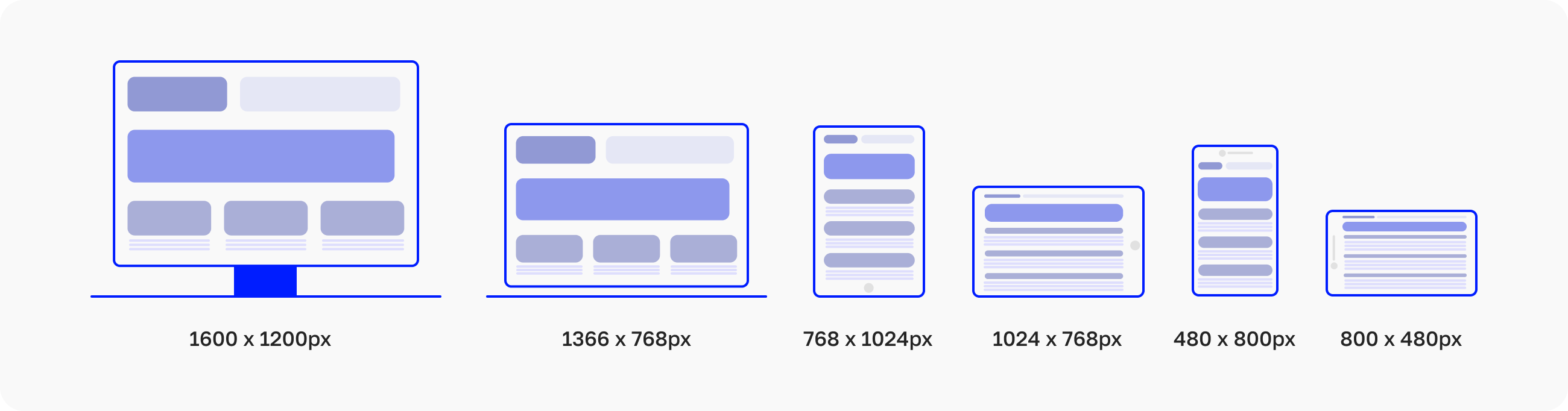
Here's an example of how the same webpage might look on different devices:

It's worth noting that in markup we go by screen resolution, not screen size. Screen size is the diagonal length in inches, while display resolution shows the number of pixels on the screen. By the way, devices with the same screen size can have different resolutions.
The minimum width of mobile devices is 320px. That means the email layout must display correctly across a range from 320px to 620px.
Adapting images
Let's start with images, and take a 600px-wide banner as an example:

You already know the code:
<span style=»font-family: Tahoma, Arial, Helvetica, sans-serif; font-size: 16px;color:#000000;»>
<img src=»creative-main.png» width=»600″ height=»500″ alt=»Альтернативный текст» border=»0″ style=»display: block; />
</span>
Everything here is standard: the banner link, alt text styles, image width and height. Except when the screen narrows, this code will break the rest of the layout — the email's elements will simply shrink down to 320px width, becoming small and unreadable.
That's why there's a rule: for all images wider than 300px you don't need to specify a fixed height. When the height isn't specified in the code, the system calculates it automatically in proportion to the image size.
For an image wider than 300px to become responsive and not break the layout, in the styles we specify the width as a percentage [100%], and the image's maximum width [600px], using the fluid approach:
<span style=»font-family: Tahoma, Arial, Helvetica, sans-serif; font-size: 16px;color:#000000;»>
<img src=»creative-main.png» width=»600″ alt=»Альтернативный текст» border=»0″ style=»display: block; width: 100%; max-width: 600px» />
</span>
Desktop versions [including Outlook] will see the width=»600″ attribute and show the banner at 600px wide. Google will read the width: 100%; max-width: 600px declaration and display the image at full width, but no more than 600px.
This way we get scaling of the image, which won't interfere with the rest of the email's content adapting.
There's one nuance with GIF images: in general, they work the same way as regular PNG images, but if Outlook 2019 doesn't see a set height for the GIF, it will break the whole layout. To prevent this, for animations we specify height in the attribute and set the value to auto in the styles:
<span style=»font-family: Tahoma, Arial, Helvetica, sans-serif; font-size: 16px;color:#000000;»>
<img src=»main.gif» width=»600″ height=»500″ alt=»Альтернативный текст» border=»0″ style=»display: block; width: 100%; max-width: 600px; height: auto» />
</span>Now Outlook 2019 will see width=»600″ height=»500″ and won't break anything, while other email clients will read height: auto, which "overrides" the previous value.
Scaling buttons
Buttons in emails come in different types:

Sometimes they're even stretched to the full width of the screen:

And here's how such a button will scale:
<table width=»100%» border=»0″ cellspacing=»0″ cellpadding=»0″ style=»width: 100%;»>
<tr><td align=»center» valign=»middle» height=»50″ bgcolor=»#000″ style=»height: 50px; display: block; background-color: #000000;»>
<!—[if gte mso 9]>
<table border=»0″ cellspacing=»0″ cellpadding=»0″>
<tr><td nowrap align=»center» valign=»middle» height=»50″ style=»padding: 0 30px;»>
<![endif]—>
<a href=»#» target=»_blank» style=»font-family: Arial, Helvetica, sans-serif; font-size: 24px; line-height: 50px; color: #ffffff; white-space: nowrap; font-weight: normal; text-decoration: none; display: block; padding: 0 30px;»>
Button text
</a>
<!—[if gte mso 9]>
</td></tr>
</table>
<![endif]—>
</td></tr>
</table>
It's important that the line height matches the button height, and that the button text is under 300px wide. If it's wider, the text will either break the adaptation by hitting the button's edges when the screen narrows [if the white-space property is set to nowrap], or it will inevitably wrap and spill outside the button.
Adapting text
Sometimes, at the design stage, a specialist comes up with a large-size heading for the email:
<div style=»line-height: 56px;»>
<span style=»font-family: Arial, Tahoma, Helvetica, sans-serif; font-size: 54px; color:#000000;font-weight: bold;»>
Heading
</span>
</div>
In such cases, when the screen narrows, the text will hit its fixed size and the layout will shift. To fix this: a) it's better not to use long, large headings; b) you can use media queries.
Let's go into the media queries, come up with a class name [for example, fs38], and specify the font size and line height that subscribers will see on a mobile device [for example, 38px and 40px]. Don't forget to add the !important declaration to set priority.
Now our media queries look like this:
@media only screen and (max-device-width: 620px), only screen and (max-width: 620px) {
.mob_100{
width:100% !important;
}
.mob_300 {
width: 300px !important;
}
.mob_center{
text-align: center !important;
}
.mob_center_bl{
float:none !important;
display: block !important;
margin: 0 auto;
}
.mob_hidden{
display:none !important;
}
.mob_no_border{
border-right-width: 0px !important;
}
.fs38 {
font-size: 38px !important;
line-height: 40px !important;
}
}
The media query isn't working yet — we've only described it in the CSS. So we assign the class in the <span> tag:
<div style=»line-height: 40px;»>
<span class=»fs38″ style=»font-family: Arial, Tahoma, Helvetica, sans-serif; font-size: 38px; color:#000000;font-weight: bold;»>
Heading
</span>
</div>
Now, when the screen narrows, the heading will take on a size of 38px. But not everywhere — Yandex doesn't recognize media queries. So it's still better not to use long and this large of headings 🙂
Media queries
Now let's take a closer look at media queries. So, here's our embedded stylesheet for enabling media queries:
<style type=»text/css»>
html { -webkit-text-size-adjust:none; -ms-text-size-adjust: none;}
@media only screen and (max-device-width: 620px), only screen and (max-width: 620px) {
.mob_100{
width:100% !important;
}
.mob_center{
text-align: center !important;
}
.mob_center_bl{
float:none !important;
display: block !important;
margin: 0 auto;
}
.mob_hidden{
display:none !important;
}
.mob_no_border{
border-right-width: 0px !important;
}
}
.mob_link a{
text-decoration:none;
color:#b1bac3;
}
.preheader{
display:none !important;
}
</style>
The first class name, .mob_100, sets the container width — in this case, 100%. Let's look at an example with two identical stacking blocks:
<table width=»100%» border=»0″ cellspacing=»0″ cellpadding=»0″>
<tr><td align=»center» valign=»top» style=»font-size: 0px;»><!—
Item —><div style=»display: inline-block;vertical-align:top;max-width:300px;width=100%»>
<table width=»100%» border=»0″ cellspacing=»0″ cellpadding=»0″ style=»border-collapse:collapse;»>
<tr><td align=»center» valign=»middle» style=»font-size: 14px;»>
<table width=»100%» border=»0″ cellspacing=»0″ cellpadding=»0″ >
<tr><td align=»center» valign=»top»>
The quick brown fox jumps over the lazy dog.
</td></tr>
</table>
</td></tr>
</table></div><!— Item END—><!—[if (gte mso 9)|(IE)]>
</td>
<td valign=»top» style=»width: 200px;»>
<![endif]—><!—
Item —><div class=»mob_100″ style=»display: inline-block;vertical-align:top; width:300px»>
<table width=»100%» border=»0″ cellspacing=»0″ cellpadding=»0″ style=»border-collapse:collapse;»>
<tr><td align=»center» valign=»middle» style=»font-size: 14px;»>
<table width=»100%» border=»0″ cellspacing=»0″ cellpadding=»0″ >
<tr><td align=»center» valign=»top»>
The quick brown fox jumps over the lazy dog.
</td></tr>
</table>
</td></tr>
</table></div><!— Item END—>
</td></tr>
</table>
On a wide screen, this code will display like this:
The quick brown fox jumps over the lazy dog. | The quick brown fox jumps over the lazy dog. |
|---|
We only assigned the class to the second block, so when the screen narrows and the content reflows, it will display like this:
The quick brown fox jumps over the lazy dog. | |
|---|---|
The quick brown fox jumps over the lazy dog. |
You can stretch an image to the full width of the screen in almost the same way. Here's the code:
<div class=»mob_100″ style=»dislay:inline-block; vertical-align:top; width:300px; «>
<table width=»100%» border=»0″ cellspacing=»0″ cellpadding=»0″ style=»border-collapse:collapse;»>
<tr><td align=»center» valign=»middle» style=»font-size: 14px;»>
<table width=»100%» border=»0″ cellspacing=»0″ cellpadding=»0″
<tr><td align=»center» valign=»top»>
<a href=»#» style=»font-family: Tahoma, Arial, Helvetica, sans-serif; font-size: 16px;color:#000000;»>
<img class=»mob_100″ src=»img.png» width=»300″ alt=»текст» border=»0″ style=»display: block;width:100%; height: auto;» />
</a>
</td></tr>
</table>
</td></tr>
</table></div>
As you can see, the image width is set here [width=»300″]. To stretch it to the full width of the screen, you need to give it the properties of a scalable image using the width:100% value in the <style> tag. The auto value, in turn, sets the image height relative to its width. Don't forget to add the mob_100 class everywhere the content should expand.
The next class, mob_center, centers the text after the content reflows. The code will look like this:
<div class=»mob_center» style=»line-height: 14px;»>
<span style=»font-family: Arial, Tahoma, Helvetica, sans-serif; font-size: 12px; color:#000000;»>
This text will be centered after reflowing.
</span>
</div>
You might be wondering: why did we assign the mob_center class to the <div> tag instead of <span>? Here's why: the text-align property in media queries only applies to block elements, and <span> is an inline element.
The mob_center_bl class works similarly, but for a block [for example, an image] instead of text. The float property determines which side the element aligns to. Meanwhile, other elements will wrap around it from the other sides until it's given a value of none — this is how we turn off the wrapping around the element.
The margin: 0 auto line sets the element's outer margin. This property can set the margin size for all sides at once — you can use up to four values, separated by spaces [for example, margin: 0 0 0 0]. In our case, we use two values: 0 and auto. The first sets a zero margin on the top and bottom edges, the second automatically calculates the margin size on the left and right edges.
The mob_hidden media query completely hides the block when reflowing, while mob_no_border hides the element's borders. After that, the closing curly brace ends the media queries.
We covered the mob_link and preheader CSS classes in detail in the third lesson, but just as a reminder: the first removes text formatting [for example, link underlines in Google], and the second hides the preheader.
So, we've covered the main media queries that come up often. You can come up with and combine other rules however you like 🙂
Dark mode
Dark mode, or Dark Mode, appeared in 2019. Since then, developers have been implementing this UI in many programs and mobile apps. And email clients, of course.

How does it work? It's simple: when Dark Mode is turned on, the page background becomes dark and the font becomes light. Some email clients do a direct "white to black" inversion, while others "pick" a dark equivalent. So, for example, if the background is built with an image, the text color gets inverted, which can affect its readability. It's important to note that different services handle dark mode differently, so the result will vary.
Take black text on a white background, for example. In dark mode, an inversion happens and everything looks as if it was always that way. But if the background is built with an image, in dark mode the black text inverts to white, while the background itself won't change. And then white text on a white background simply disappears.
The only solution to this problem is to add transparency at the design stage. You don't need to create a separate layout for dark mode, but a designer can double-check by creating a darkened block and seeing how the banner looks against it in dark mode.
Even better — make the background a color where both white and black text will read well:

It's important to remember: if the background is built with code, its color will also be inverted. However, some gradients need to be built as images: a simple two-color gradient is easy to build with code, but a more complex one won't work that way.

Black-and-white or gray icons used in the email design should have an outline in the background color [1–1.5 px]. It won't be visible in light mode, but it will definitely show in dark mode. The same rule applies to custom fonts used in headings.

If a button is built with code, it will also be inverted. If the button has an outline in light mode, you can avoid this by building buttons as images, adding a fill in the background color. In light mode this will look like an outline, and in dark mode — like a regular button.

Another option for button design is to add an outline or a glow. They won't be visible in light mode, but in dark mode this ensures the element doesn't get lost. The main thing is to find a balance so the contrast stays consistent everywhere.

Images, including GIFs, won't change at all in dark mode. The colors stay the same, but if a button or text is layered on top of a GIF, those elements will adapt to the new dark-mode reality. You can avoid this in two ways: build the button and text as an image, or make the background GIF a color that keeps the other elements contrasting against it.
Shadows in dark mode look like a glow, so it's worth cranking up their transparency to around 25% — could be more, could be less. Shadows on GIFs are a whole separate story — they save very poorly and sometimes don't display at all, because the GIF format doesn't support semi-transparency. So it's best not to use shadows on a transparent background in animations at all.
Developer menu
It will help you check the layout, and yourself along the way. Once the email is assembled, you can open it right in a browser and check how the code renders using developer tools.
Here's how: right-click the HTML file and open it in a browser. In most Windows browsers, you can open the developer panel with the F12 key; in Chrome on Mac, use Cmd+Opt+J; and in Safari — Cmd+Opt+C [but you'll need to enable the "Develop menu" in settings first]. Here's what it looks like:

In the top panel, you select a device model or set the screen dimensions yourself:

By selecting "Responsive", you can narrow and widen the email however you like:

You can work in parallel with a code editor here: just open the same HTML file in the editor, make changes, and save. Then, after refreshing the browser page, the email will display with your edits. A developer's work mostly centers on the Elements panel — it shows the HTML tree, which helps with the markup.
You can read more about how to work with developer tools in your browser's help section — here, for example, is the guide from Google.
So, that's 8 lessons on email markup behind us, and the home stretch is ahead! You can now easily put together an email, but that's only 50% of its success. In the final lesson, we'll cover how to test emails — so we can make sure everything works and looks good.
🔍 Test your email in Letteros right after building it!