
Putting together a beautiful email mockup and handing it off for coding is the designer's job.
But to code the designer's mockups more efficiently, a coder also needs to know how to work with graphics. The mockup is where they get all the necessary information — text, illustrations, element positioning, and spacing between elements.
That makes a graphics editor the second most important tool a coder needs, right after their code editor. We work in Figma — a collaborative online editor for web interfaces.
Designers, marketers, and developers can all work in Figma. You can draw email elements, create a main banner, illustrations, vector graphics. Developers even get a Dev Mode, which lets you copy elements' CSS styles and their Android and iOS code.
There's another option: Photoshop. But it has a complex interface with a ton of tools, info panels, and tabs that a coder often doesn't need. So we'll stick with the first option.
Figma is a graphics editor, so most of its interface elements are built for designers and probably won't be useful to us. So from here on, we'll only cover the tools and features a coder actually needs.
The app, sign-up, and pricing plans
You can work in Figma right in your browser or through a desktop app installed on your computer. To download it, go to the link and choose the version for iOS or Windows. And yes, it's free.
Also download the Figma Mirror app [Android /iOS]. It helps you see how the design will look on a mobile device. This is free too.
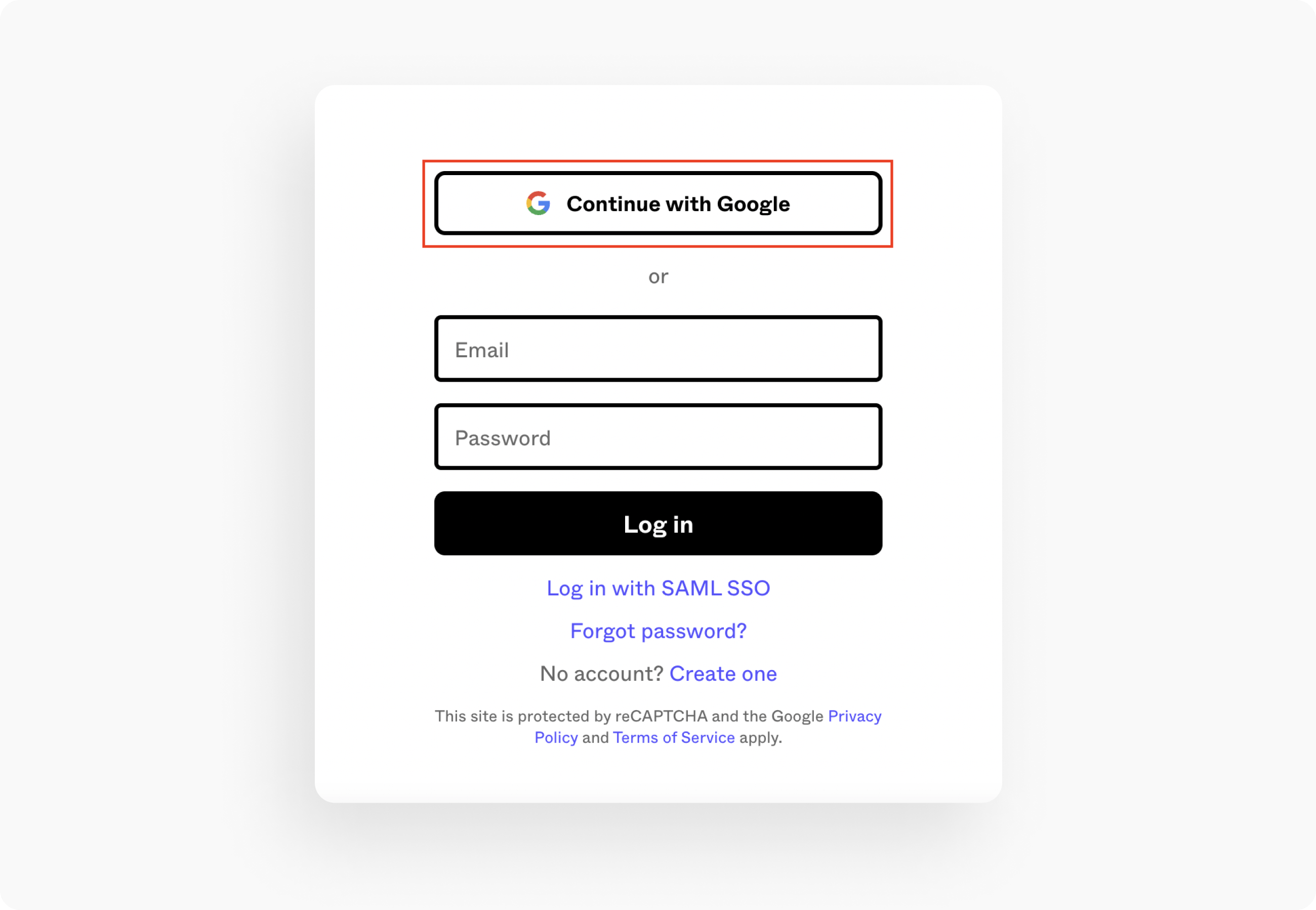
Signing up for Figma is easy: just click the black "Sign up" button. The simplest way to sign up is with a Google account:

But if you don't have a Google account, you can use another email instead. This is free too, by the way.
Figma has three usage tiers: starter, professional, and organization. The first one is free for everyone and includes unlimited cloud storage. There's also no limit on how many users can view projects. But there are some restrictions:
- no more than two users can work on a single file at the same time;
- a single team can work on a maximum of three projects;
- the history of actions on files and projects is stored for 30 days.
The professional and organization tiers are paid:

Payment isn't something you need to worry about until you're working in a team — that's when it makes sense to get the right plan.
Getting started
Figma has two workspaces: the graphics editor and the file manager, where you can create projects and change your profile settings. After logging in, you'll see a dashboard with your projects and some example mockups:

The left-hand menu is the file manager. The Recents tab shows all your recent files, and the Drafts tab shows all the recent projects you've worked on. Below that are your projects and teams — you can also create new ones by clicking "+".
As soon as you create a team, Figma will automatically make a new project for it by default. A project is a folder that holds all the files related to a single project — a client, a brand, and so on. And if there's no need to create teams and manage projects, you can invite other users to collaborate on a file through the blue "Share" button.
To get into the graphics editor workspace, click "New design file" or open any available file:

This is where all the magic happens: designers turn copy into an email mockup, and coders find everything they need to code it — text, illustrations, object parameters.
In an open file, three areas are available to the user: the canvas, the toolbar, and the layers panel.
The top toolbar
It looks like this:

The first tab, with the Figma logo, opens a dropdown menu. What interests us here is search — it searches menu items and comes in handy when you need a specific command but forgot where to find it.

To the right of the menu tab are the tools. The first one by default is Move, which selects layers. Be careful with it — you can accidentally shift elements. The second-to-last tool, with a hand icon, called Hand tool, lets you pan around the mockup without moving any elements.
The last tool icon is comments. It comes in handy when several people are working on a mockup at the same time.
The service lets you leave comments and reply to them. A list of all comments is available in the right-hand panel:

In the middle of the top toolbar, you'll see the file name, which you can change right there:

On the right side of the toolbar are your profile photo, the blue "Share" button, a view button, and zoom controls. To zoom in or out of the mockup, you can also use the keyboard shortcut Ctrl and +/- (Cmd and +/- on Mac). We covered other hotkeys in detail in this article.
The layers panel
The left-hand panel holds the list of layers, pages, and graphic elements:

This panel's menu includes Layers, Assets, and the file name with a dropdown where you can see Pages and switch between the pages of a mockup.
Below that are the mockup's layers. The biggest layers (frames) are marked in bold with a hash symbol (#). Expand them, and you'll see that each layer has its own icon indicating what it contains:

Text layers are marked with the letter T, raster graphics with an image icon, and components from Assets are highlighted in purple. A vector graphic layer shows up as its own shape or curve, while hidden layers turn gray and are marked with a closed-eye icon.
To see information about a layer and its content, just select the layer. All the data appears in the right-hand toolbar:

The right-hand toolbar
The right-hand toolbar has three tabs: Design, Prototype, and Inspect. We'll work with the first and the last one. By the way, in the Code section of the Inspect tab, you can choose the output language (CSS by default):

Let's take a closer look at the Design tab:

Below that are other sections:
- Layer — layer opacity;
- Text — text;
- Fill — color fill;
- Stroke — outlines;
- Effects — shadows and blur.
If there's no data, these sections won't appear at all, or their labels will show up in faded gray if they're inactive.
The last tab, Export, lets you export any layer as PNG, SVG, JPG, or PDF, or preview it.
Export
To download an image from Figma, find it in the layers and select it. Then expand the Export section, choose the size and format to export the image in, and click the button below:

Images with lots of colors — photos, for instance — are best saved as JPEG. Just remember that JPEG's compression algorithm shrinks images at the cost of quality. Icons, diagrams, infographics, and images with transparency, on the other hand, are best saved as PNG.
Retina
Retina displays have a higher pixel density. What looks fine on a regular display becomes a problem on a Retina one. If you open an image that isn't adapted for Retina on a Retina display, you'll see pixelation and blurriness.

But this problem is easy to solve: save two versions of an image — one with standard pixel density and one at higher density for Retina. In Figma, this is simple: just export the image at 2x. That version will look perfect on Retina displays.
Text data
The font, style, size, and other text properties are found in the Text tab of the same name. Just click a text layer to see all its parameters. The text color is shown a bit lower, in the Fill tab.
Which text data from Figma is useful to a coder:
— font, family, and type (serif or sans-serif);
— size;
— weight (style);
— color;
— opacity, gradient, effects;
— alignment;
— line height;
— letter spacing.
You can copy all of this straight into CSS in the Inspect tab:

Roboto; it's better (and more correct) to write it as: font-family: "Roboto", "Arial", sans-serif;. We'll go into more detail on this in the next lesson.
You can copy the text itself from the layer or right from the canvas. To do this, right-click the text layer in the Layers panel and find the Copy option in the menu that opens:

Size and spacing data
You can see the height and width values in the Inspect tab. Another option is to select the block you need, and the size will appear underneath the element:

To see the distance between objects, select the first element, then hover your cursor over another element:

Color and effects data
In the Inspect tab, Figma shows colors in HEX format by default, for example: #808080. But color has another property too — opacity. In that case, it's expressed like this: color: #808080; opacity: 50%;. That's the same gray at 50% opacity.
If the designer applied every available effect to an element — gradient, shadow, blur, rounded corners — you'll see something like this in Figma's CSS:
.button {
background: linear-gradient(90deg, #FF1100 0%, #FF8A00 100%);
box-shadow: 0px 2px 2px rgba(0, 0, 0, 0.25);
filter: blur(4px);
border-radius: 10px;
}
Here, linear-gradient is the gradient, box-shadow is the container's shadow, filter is the blur, and border-radius is the corner rounding.
So, we've covered how to work with Figma's main tools and interface. As you can see, learning this tool isn't hard — a couple of YouTube video tutorials will do the trick.
Now that you know how to export images, let's move on to writing the code to insert them (and more)!
✨ Want to optimize images for an email or compress the HTML? You can do that right in the Letteros editor!