
You learned about email structure in the last lesson — today we'll revisit it, but this time in the language of HTML: we'll "decode" the email's code.
Open the code of any web page and you'll see it contains typical elements that stay the same regardless of the site's type or focus. It's the same story with emails.
We've prepared a blank email code template that we use ourselves. We'll use it to break down the main elements of an email's code:
<!DOCTYPE HTML PUBLIC «-//W3C//DTD HTML 4.01 Transitional//EN» «http://www.w3.org/TR/html4/loose.dtd»>
<html xmlns=»http://www.w3.org/1999/xhtml»
xmlns:v=»urn:schemas-microsoft-com:vml»
xmlns:o=»urn:schemas-microsoft-com:office:office»>
<head>
<!—[if gte mso 9]><xml>
<o:OfficeDocumentSettings>
<o:AllowPNG/>
<o:PixelsPerInch>96</o:PixelsPerInch>
</o:OfficeDocumentSettings>
</xml><![endif]—>
<meta http-equiv=»Content-Type» content=»text/html; charset=utf-8″ >
<meta name=»viewport» content=»width=device-width, initial-scale=1.0″>
<meta http-equiv=»X-UA-Compatible» content=»IE=edge» />
<meta name=»x-apple-disable-message-reformatting»>
<title>-</title>
<style type=»text/css»>
html { -webkit-text-size-adjust:none; -ms-text-size-adjust: none;}
@media only screen and (max-device-width: 620px), only screen and (max-width: 620px) {
.mob_100{
width:100% !important;
}
.mob_center{
text-align: center !important;
}
.mob_center_bl{
float:none !important;
display: block !important;
margin: 0 auto;
}
.mob_hidden{
display:none !important;
}
.mob_no_border{
border-right-width: 0px !important;
}
}
.mob_link a{
text-decoration:none;
color:#b1bac3;
}
.preheader{
display:none !important;
}
</style>
<style type=»text/css»>
@-ms-viewport{width:device-width}
</style>
</head>
<body style=»padding:0px;margin:0px;»>
<div id=»mailsub» class=»notification» align=»center» style=»word-break:normal;-webkit-text-size-adjust:none; -ms-text-size-adjust: none;line-height: normal;»>
<table width=»100%» border=»0″ cellspacing=»0″ cellpadding=»0″ style=»line-height: normal;»>
<tr>
<td align=»center» bgcolor=»#ffffff»>
<!—[if (gte mso 9)|(IE)]>
<table width=»620″ border=»0″ cellspacing=»0″ cellpadding=»0″ style=»width:620px;»><tr><td>
<![endif]—>
<div style=»overflow:hidden;»>
<table border=»0″ cellspacing=»0″ cellpadding=»0″ width=»100%» style=»max-width: 620px;»>
<tr><td align=»center» style=»padding-right: 10px; padding-left: 10px;»>
<!—[if !mso]><!—>
<div class=»preheader» style=»font-size: 0px; color: #F6F7F9; line-height: 0px;»>
<span style=»font-family: Arial, Helvetica, sans-serif; font-size: 0px; color: #F6F7F9; line-height: 0px;»>preheader ‌ ‌ ‌ ‌ ‌ ‌ ‌ ‌ ‌ ‌ ‌ ‌ ‌ ‌ ‌ ‌ ‌ ‌ ‌ ‌ ‌ ‌ ‌ ‌ ‌ ‌ ‌ ‌ ‌ ‌ ‌ ‌ ‌ ‌ ‌ ‌ ‌ ‌ ‌ ‌ ‌ ‌ ‌ ‌ ‌ ‌ ‌ ‌ ‌ ‌ ‌ ‌ ‌ ‌ ‌ ‌ ‌ ‌ ‌ ‌ ‌ ‌ ‌ ‌ ‌ ‌ ‌ ‌ ‌ ‌ ‌ ‌ ‌ ‌ ‌ ‌ ‌ ‌ ‌ ‌ ‌ ‌ ‌ ‌ ‌ ‌ ‌ ‌ ‌ ‌ ‌ ‌ ‌ ‌ ‌ ‌ ‌ ‌ ‌ ‌ ‌ ‌ ‌ ‌ ‌ ‌ ‌ ‌ ‌ ‌ ‌ ‌ ‌ ‌ ‌ ‌ ‌ ‌ ‌ ‌ ‌ ‌ ‌ ‌ ‌ ‌ ‌ ‌ ‌ ‌ ‌ ‌ ‌ ‌ ‌ ‌ ‌ ‌ ‌ ‌ ‌ ‌ ‌ ‌ ‌ ‌ ‌ ‌ ‌ ‌⠀⠀⠀⠀⠀⠀⠀⠀⠀⠀⠀⠀⠀⠀⠀⠀⠀⠀⠀⠀⠀⠀⠀⠀⠀⠀⠀⠀⠀⠀⠀⠀⠀⠀⠀⠀⠀⠀⠀⠀⠀⠀⠀⠀⠀⠀⠀⠀⠀⠀⠀⠀⠀⠀⠀⠀⠀⠀⠀⠀⠀⠀⠀⠀⠀⠀⠀⠀⠀⠀⠀⠀⠀⠀⠀⠀⠀⠀⠀⠀⠀⠀⠀⠀⠀⠀⠀⠀⠀⠀⠀⠀⠀⠀⠀⠀⠀⠀⠀⠀⠀⠀⠀⠀⠀⠀⠀⠀⠀⠀⠀⠀⠀⠀⠀⠀⠀⠀⠀⠀⠀⠀⠀⠀⠀⠀⠀⠀⠀⠀⠀⠀⠀⠀⠀⠀⠀⠀⠀⠀⠀⠀⠀⠀⠀⠀⠀⠀⠀⠀⠀⠀⠀⠀⠀</span>
</div>
<!—<![endif]—>
<!—header—>
<table border=»0″ cellspacing=»0″ cellpadding=»0″ width=»100%»>
<tr><td align=»center»>
</td>
</tr>
</table>
<!—header END—>
<!—body—>
<table border=»0″ cellspacing=»0″ cellpadding=»0″ width=»100%»>
<tr><td align=»center»>
</td></tr>
</table>
<!—body END—>
<!—footer—>
<table border=»0″ cellspacing=»0″ cellpadding=»0″ width=»100%»>
<tr><td align=»center»>
</td></tr>
</table>
<!—footer END—>
</td></tr>
</table>
</div>
<!—[if (gte mso 9)|(IE)]>
</td></tr>
</table>
<![endif]—>
</td></tr></table>
</div>
</body>
</html>
By the way, you can copy this code and use it in your own work [yes, it's free 🙂]. Now let's go through it step by step.
Page information
<!DOCTYPE HTML PUBLIC «-//W3C//DTD HTML 4.01 Transitional//EN» «http://www.w3.org/TR/html4/loose.dtd»>
You're already familiar with this element — it specifies the HTML version that will be used in the markup.
<html xmlns=»http://www.w3.org/1999/xhtml»
xmlns:v=»urn:schemas-microsoft-com:vml»
xmlns:o=»urn:schemas-microsoft-com:office:office»>
This xmlns attribute on the html tag [which, as you remember, you can't do without] lets you work with VML [Vector Markup Language]. Here, the vml parameter is used specifically for Outlook and gives us more control over certain email elements.
By the way, you don't need to know the VML language to code emails, but we'll cover this topic in more detail in one of the upcoming lessons.
<head>
The opening head tag you already know, which carries information about the page.
<!—[if gte mso 9]><xml>
<o:OfficeDocumentSettings>
<o:AllowPNG/>
<o:PixelsPerInch>96</o:PixelsPerInch>
</o:OfficeDocumentSettings>
</xml><![endif]—>
Outlook email clients have their own quirks, including DPI (Dots Per Inch) scaling issues. This snippet of code is meant for all Outlook clients and helps prevent image scaling that causes rendering problems.
By the way, without the vml we covered above, this code won't work.
<meta http-equiv=»Content-Type» content=»text/html; charset=utf-8″ >
The <meta> tag defines metatags [tags that carry information about the email's content]. In practice, the Content-Type value specifies the document's encoding [utf-8 is the encoding itself].
There are many different <meta> tags, but we'll focus on the ones that provide a solid foundation for email markup.
<meta name=»viewport» content=»width=device-width, initial-scale=1.0″>
The name attribute is the metatag's name. Viewport is the area of the page visible to the user without scrolling. This is how we tell the browser exactly how to handle the page size and change its scale.
Here, width is the viewport width. The device-width value sets the page width to match the screen size. It can also be set as an integer from 200 to 10,000 pixels. Initial-scale defines the page's starting zoom level [from 0.1 to 1.0], where 1.0 means a 1:1 scale [i.e., not zoomed].
<meta http-equiv=»X-UA-Compatible» content=»IE=edge» />
A hack for Outlook support. More specifically, X-UA-Compatible specifies the Internet Explorer version [edge, in this case] and tells the browser to render the document in a particular mode.
<meta name=»x-apple-disable-message-reformatting»>
This hack helps solve the auto-scaling issue for emails in iOS 10 and iOS.
The metatags listed above are all standard stuff that doesn't change from email to email. Now that we've covered them, let's move on.
<title>…</title>
Defines the document's title. The element itself isn't shown on the web page — its content appears in the browser tab's title instead. In email markup, this is where you typically put the subject line, so the user can see it when opening the email in the web version.
Styles and media queries
<style type=»text/css»>
The opening <style> tag you already know, which defines CSS styles for media queries. The type attribute tells the browser which syntax to use to correctly parse the styles.
html { -webkit-text-size-adjust:none; -ms-text-size-adjust: none;}
This line is needed so the WebKit engine doesn't change the text size, keeping the email displaying correctly.
@media only screen and (max-device-width: 620px), only screen and (max-width: 620px) {
.mob_100{
width:100% !important;
}
.mob_center{
text-align: center !important;
}
.mob_center_bl{
float:none !important;
display: block !important;
margin: 0 auto;
}
.mob_hidden{
display:none !important;
}
.mob_no_border{
border-right-width: 0px !important;
}
}
In this block, we use an embedded style sheet to enable media queries. These are commands that adapt the content to the screen resolution. The max-width query is most commonly used for this.
Once a media query detects any width below the specified maximum, all the CSS rules inside it take effect. This lets you, for example, change heading sizes so they fit better on mobile devices.
Inside @media, you can specify particular device types: all, print, speech [for screen readers], and screen [for devices with screens]. For emails, the last one is used in almost every case.
Let's go through the media query classes in order and see what the styles inside them do:
- .mob_100 makes the container 100% wide;
- .mob_center centers the text;
- .mob_center_bl centers the block;
- .mob_hidden hides the block;
- .mob_no_border hides block borders.
Notice the !important declaration — we talked about it in the first lesson. This is exactly the situation where we need to override priority: inline styles won't respond to these CSS properties unless this declaration is added.
These are the media queries we use ourselves in our emails, but it all depends on the result you're going for. You can add other classes to the code too — just keep sharpening your CSS skills 😉
.mob_link a{
text-decoration:none;
color:#b1bac3;
}
.preheader{
display:none !important;
}
</style>
Here, the class name .mob_link with the a selector removes the underline from every link in the document, turning them gray. Here's the thing: Gmail, for example, automatically underlines anything it thinks looks like a link. To avoid this, you need to add the .mob_link class name to the <span> tag and write in the styles the text needs.
Next comes .preheader — it hides the preheader. Then the closing </style> tag.
<style type=»text/css»>
@-ms-viewport{width:device-width}
</style>
</head>
The next media query is used to configure the screen viewport width in Outlook, which adapts to the device width. After that, the </head> tag closes off the page information.
Now let's talk about the email's content.
The email body
Although the main code will differ significantly from one campaign to another, there are a few elements that need to be included in every email.
<body style=»padding:0px;margin:0px;»>
Style properties are written into the style attribute of the <body> tag. This particular line zeroes out our table's outer and inner spacing.
The thing is, different rendering engines display the same elements differently. To prevent this and make the email look equally good across devices, we set the padding and margin values to 0.
<div id=»mailsub» align=»center» style=»word-break:normal;-webkit-text-size-adjust:none; -ms-text-size-adjust: none;line-height: normal;»>
We also wrap the entire email in a <div> tag [a block-level element you can use to isolate a piece of the document and modify its content]. To get rid of the large margins that Mail.ru adds, we include id="mailsub". The align attribute centers the container's content.
Next come the styles: word-break wraps words onto a new line by hyphenating them [with a value of none, so nothing will wrap]; -webkit-text-size-adjust and -ms-text-size-adjust prevent the text size from changing across different rendering engines; line-height controls the line spacing.
The main table
We use the opening <table> tag to start the table:
<table width=»100%» border=»0″ cellspacing=»0″ cellpadding=»0″>
This line tells us the table is 100% wide and its borders are invisible [border="0"]. The cellspacing attribute sets the distance between the cells' outer edges, while cellpadding sets the distance between a cell's edge and its content. As you can see, everything here is set to zero.
<tr>
<td align=»center» bgcolor=»#ffffff»>
The <tr> you already know defines a row, and <td> defines a cell. Here, the cell's content is centered, and the background [bgcolor] is filled white.
<div style=»overflow:hidden;»>
<table border=»0″ cellspacing=»0″ cellpadding=»0″ width=»100%» style=»max-width: 620px;»>
Now we need to narrow our table down to 620px, where 600px is the standard email width and 10px on each side is the minimum spacing so content doesn't "stick" to the edges. By the way, developers refer to this kind of spacing as "ears."
The overflow property specifies how a block element's content should behave if its size exceeds the allowed height or width. A value of hidden means that content won't be displayed.
Next comes our table, now narrowed to 620px using the max-width value [the container's maximum width]. Since width is set to 100%, our table tries to take up all the space available to it, but no more than 620px.
The catch is that Outlook doesn't know the max-width property — it only sees width="100%". So for Outlook, we write conditional comments [comments that only Outlook reads]:
<!—[if (gte mso 9)|(IE)]>
<table width=»620″ border=»0″ cellspacing=»0″ cellpadding=»0″ style=»width:620px;»>
<tr><td>
<![endif]—>
Here, <!--[if (gte mso 9)|(IE)]> is the start of the conditional comment, telling us that this snippet of code is for Outlook. And <![endif]--> closes the comment. Basically, everything between <!--...--> gets read as a conditional comment.
Here's how it works: Outlook sees the conditional comment, inside which we essentially create a copy of our table that's invisible to other email clients. And that's where we "funnel" the content.
This matters: if you skip this conditional comment, the email will stretch to fill the entire screen width in Outlook.
So, we've narrowed the table to 620px. What's next:
<tr><td align=»center» style=»padding-left: 10px;padding-right: 10px;»>
Inside the already-narrowed table, we set the align attribute, which centers all the content. Padding-left andpadding-right set those same 10px margins so the content doesn't "stick" to the edges.
Next comes the preheader.
The preheader
Coming up with a great preheader is a copywriter's job. We'll cover how to code it. The standard markup for every preheader:
<!—[if !mso]><!—>
<div class=»preheader» style=»font-size: 0px; color: #ffffff; line-height: 0px;»>
<span style=»font-family: Arial, Helvetica, sans-serif; font-size: 0px; color: #F6F7F9; line-height: 0px;»>preheader</span>
</div>
<!—<![endif]—>
It starts with an Outlook comment <!--[if !mso]><!-->, so the email client can recognize the preheader. Next comes a <div> block with the preheader class and properties that we all zero out [to make sure the preheader definitely isn't visible].
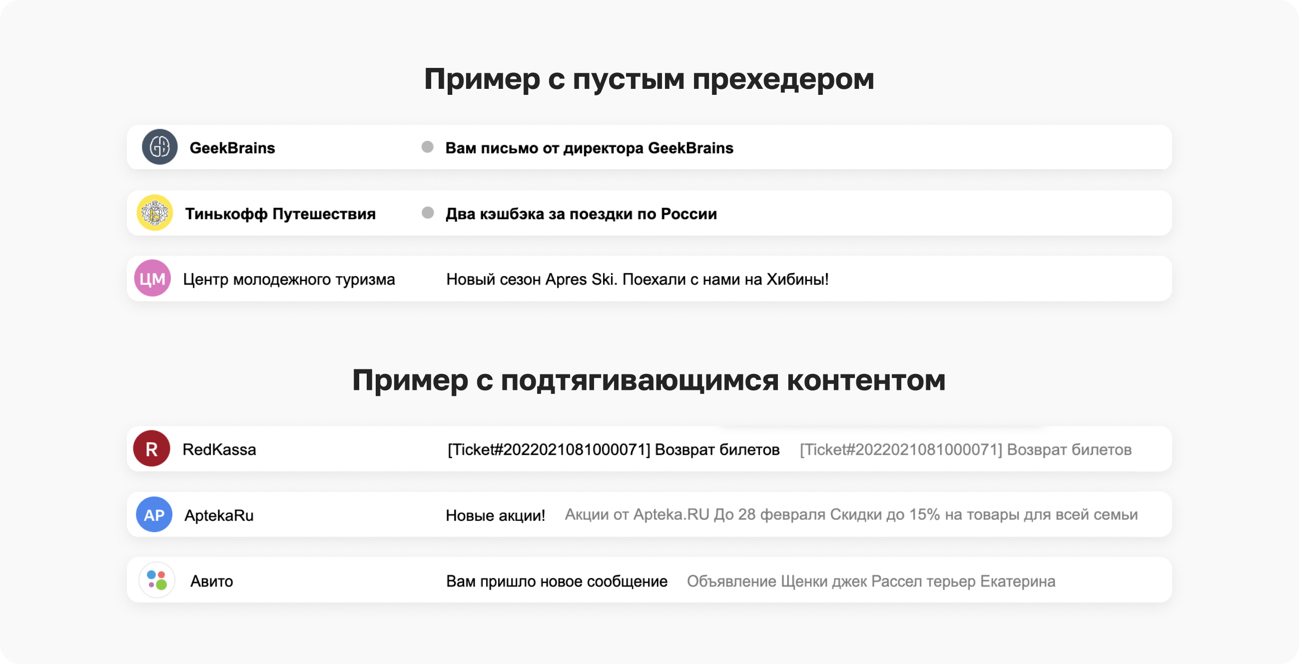
Preheaders can be visible or invisible. A visible preheader is what you see in your inbox after the subject line. An invisible one is a placeholder that keeps the email's actual content from showing up in the preheader spot:

The <span> tag defines the text style, followed by the preheader text itself. But the preheader text can be short, in which case other elements of the email will get pulled in right after it.To avoid this, we add spaces into the preheader text. The final markup ends up looking like this:
<!—[if !mso]><!—>
<div class=»preheader» style=»font-size: 0px; color: #F6F7F9; line-height: 0px;»>
<span style=»font-family: Arial, Helvetica, sans-serif; font-size: 0px; color: #F6F7F9; line-height: 0px;»>preheader ‌ ‌ ‌ ‌ ‌ ‌ ‌ ‌ ‌ ‌ ‌ ‌ ‌ ‌ ‌ ‌ ‌ ‌ ‌ ‌ ‌ ‌ ‌ ‌ ‌ ‌ ‌ ‌ ‌ ‌ ‌ ‌ ‌ ‌ ‌ ‌ ‌ ‌ ‌ ‌ ‌ ‌ ‌ ‌ ‌ ‌ ‌ ‌ ‌ ‌ ‌ ‌ ‌ ‌ ‌ ‌ ‌ ‌ ‌ ‌ ‌ ‌ ‌ ‌ ‌ ‌ ‌ ‌ ‌ ‌ ‌ ‌ ‌ ‌ ‌ ‌ ‌ ‌ ‌ ‌ ‌ ‌ ‌ ‌ ‌ ‌ ‌ ‌ ‌ ‌ ‌ ‌ ‌ ‌ ‌ ‌ ‌ ‌ ‌ ‌ ‌ ‌ ‌ ‌ ‌ ‌ ‌ ‌ ‌ ‌ ‌ ‌ ‌ ‌ ‌ ‌ ‌ ‌ ‌ ‌ ‌ ‌ ‌ ‌ ‌ ‌ ‌ ‌ ‌ ‌ ‌ ‌ ‌ ‌ ‌ ‌ ‌ ‌ ‌ ‌ ‌ ‌ ‌ ‌ ‌ ‌ ‌ ‌ ‌ ‌⠀⠀⠀⠀⠀⠀⠀⠀⠀⠀⠀⠀⠀⠀⠀⠀⠀⠀⠀⠀⠀⠀⠀⠀⠀⠀⠀⠀⠀⠀⠀⠀⠀⠀⠀⠀⠀⠀⠀⠀⠀⠀⠀⠀⠀⠀⠀⠀⠀⠀⠀⠀⠀⠀⠀⠀⠀⠀⠀⠀⠀⠀⠀⠀⠀⠀⠀⠀⠀⠀⠀⠀⠀⠀⠀⠀⠀⠀⠀⠀⠀⠀⠀⠀⠀⠀⠀⠀⠀⠀⠀⠀⠀⠀⠀⠀⠀⠀⠀⠀⠀⠀⠀⠀⠀⠀⠀⠀⠀⠀⠀⠀⠀⠀⠀⠀⠀⠀⠀⠀⠀⠀⠀⠀⠀⠀⠀⠀⠀⠀⠀⠀⠀⠀⠀⠀⠀⠀⠀⠀⠀⠀⠀⠀⠀⠀⠀⠀⠀⠀⠀⠀⠀⠀⠀</span>
</div>
<!—<![endif]—>
Yep, all of that is just non-breaking space characters in HTML, in different encodings 🙂
So, our email's main table is ready. All that's left is the easy part [not really]: moving on to the email's content. For convenience, it's best to split the content into three parts: header, body, and footer.
Header:
<!—header—>
<table border=»0″ cellspacing=»0″ cellpadding=»0″ width=»100%»>
<tr><td align=»center»>
header goes here
</td></tr>
</table>
<!—header END—>
Body:
<!—body—>
<table border=»0″ cellspacing=»0″ cellpadding=»0″ width=»100%»>
<tr><td align=»center»>
email body
</td></tr>
</table>
<!—body END→
Footer:
<!—footer—>
<table border=»0″ cellspacing=»0″ cellpadding=»0″ width=»100%»>
<tr><td align=»center»>
footer goes here
</td></tr>
</table>
<!—footer END—>
In the next lesson, we'll learn how to fill them with content 😉
🔒 All of these elements are critical for deliverability! Letteros configures SPF/DKIM/DMARC automatically. Go to your account.