
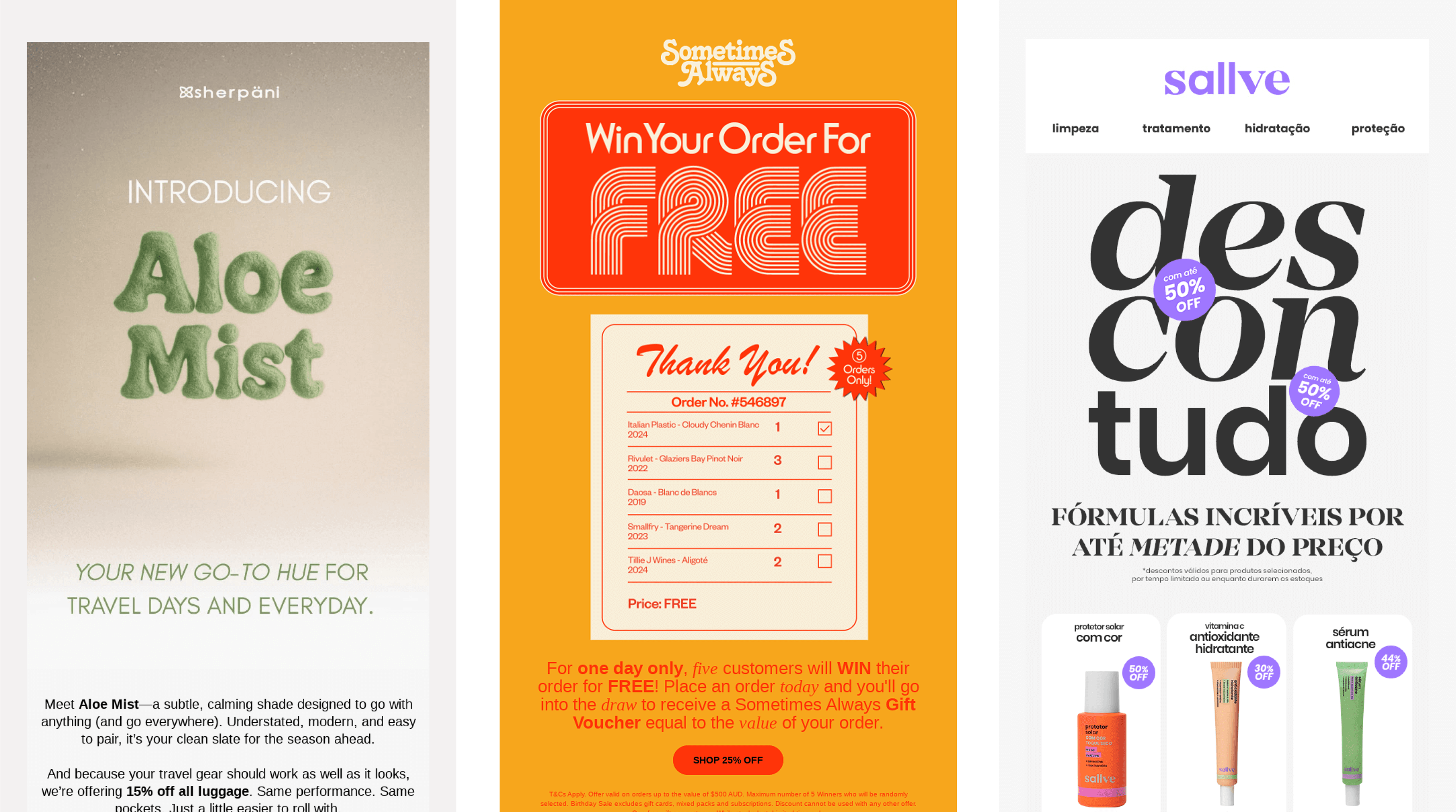
Email design has long evolved alongside the web and product interfaces: the same font experiments, tactile minimalism, retro aesthetics, and AI illustrations feel right at home in email campaigns too.
In this article, we'll break down which visual solutions took hold in 2025 and which styles are already shaping the approach to email design for 2026.
What's shaping email design trends in 2025
2025 became the year visual systems got rebuilt. Trends were heavily shaped by:
- neural networks, which stopped being just "generators" and became full-fledged co-authoring tools, for example, "human + AI" hybrid design;
- fatigue from visual noise and users' desire for simple, tactile, soft interfaces;
- retro nostalgia, which has influenced graphics and typography for several years now, e.g. pixelation, retro, vintage;
- increased mobile consumption — mobile-first and responsiveness have become mandatory;growing personalization — users want emails that feel "built just for them".
All of this has shaped concrete visual trends, which we'll break down now.
Trend #1. Text becomes graphics: macro-typography and experimental fonts
Macro-typography is one of the strongest trends of recent years.
Why it works in email:
- Email clients render heavy graphics poorly, but they display text beautifully.
- Large typography solves the problem of engagement without images.
- Experimental fonts let a brand stand out even in a super-minimalist composition.
How to apply it:
- Use large typography above the fold.
- Build font-based compositions into promo blocks instead of banners.
- Combine text with monochrome accents: this works both for contrast and readability.
Common mistakes:
- Too many decorative fonts in one email.
- Not accounting for mobile-first: long words break awkwardly.
- Using complex custom fonts — some users will just see Arial.

Trend #2. AI-generated illustrations: hybrid style and AI-abstract
In 2025, AI graphics stopped being a "gimmick" and became a tool. Especially in email, where illustration budgets are often tight but you still want expressiveness.
Two directions stand out:
- hybrid design — human + AI: a designer creates the idea, AI helps with complex textures and details, or the other way around;
- AI Abstract — generative glitches, surreal, acid-like shapes.
Why AI graphics became a trend in email:
- Lets you put campaigns together quickly without waiting for an illustrator.
- Became easier to adapt to a lightweight image size.

How to apply it:
- Use AI illustrations as background banners or roundup covers.
- Create "hybrid" visuals: real elements + digital textures.
- Experiment with texture, but keep image weight under 200–300 KB.
Mistakes:
- Overly acid, overly detailed visuals in emails for a formal audience.
- Glitches and surrealism unrelated to the product.
- Files too heavy for mobile.
Trend #3. Tactile minimalism: soft shadows, depth, physicality
Tactile minimalism has become prominent, staying visually light while still conveying depth and "physicality".
Key elements of the trend:
- soft, diffused shadows;
- glassy, matte, or velvety surfaces;
- volume that's felt even in static images;
- minimal detail, maximum "feel".
Why users like it:
- tactility creates a sense of the product's physical presence;
- minimalism saves cognitive resources;
How to use it in emails:
- product cards with soft shadows;
- glassy CTA buttons with a light blur;
- soft textures in the background instead of plain white.

Trend #4. Retrofuturism, pixelation, and 90s aesthetics
In 2025 digital design, retro and pixel art continue to bring back visual nostalgia for the 50s, 70s, and 90s, and brands are actively using this mood in their emails.
- pixel elements in illustrations;
- recreating the look of Windows 98 interfaces;
- using retro fonts;
- 90s-style "postcards".
Why the trend persists:
- users are tired of overly sterile design;
- retro creates recognizability and evokes "childhood memory" emotions;
- pixel art works great in low-res email formats.
Recommendations:
- use pixel headers for special projects;
- add retro elements as visual support;
- avoid excessive "noise" — the email should stay readable.

Trend #5. Humanity: simple illustrations, hand-drawn elements, emotion
This style has long been established in web design, and it's just as fitting in email — "living" touches soften the email's structure and help a brand sound more human.
Manifestations of the trend:
- hand-drawn arrows, underlines, micro-doodles;
- simple, even childlike illustrations;
- a contrast between lively content and a clean structure;
- humor, memes, and light jokes.

Trend #6. Gamification and storytelling
Storytelling and game mechanics entered digital design and marketing as a way to hold attention several years ago.
How to use it in emails:
- "mini-games" (choosing options, riddles, mini-quests);
- interactivity that works even without AMP;
- step-by-step stories.
Why users like it:
- game mechanics engage: the reader feels the email isn't just an information block, but a small interactive experience;
- playing gives a sense of excitement and anticipation of a result;
- the feeling of "this time I'll get lucky" — gamification boosts motivation to read the email to the end, especially when the user sees a clear reward.
An example from the trends — the Kuper email campaign is a great case study of how storytelling and game scenarios boost engagement. + others
