
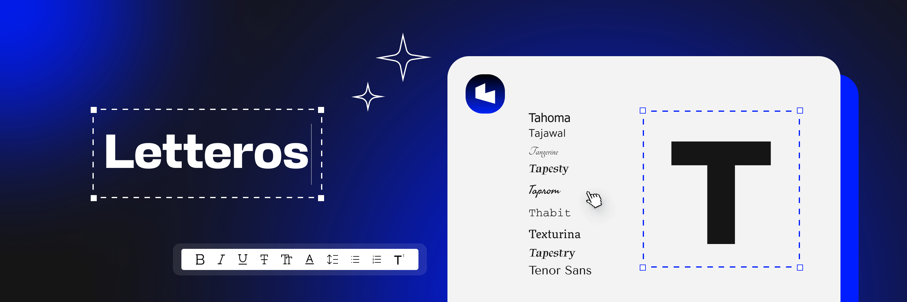

Shape, weight, color, size, spacing. All of these factors affect how recipients perceive your email.
We've put together a list of important tips that will help you format your email correctly, so an email test doesn't go pȃìnfülly wrøng⍰. Plus, our own ranking of top modern web-safe fonts.
Types of fonts
There are 2 broad groups: with serifs (serif) and without them (known as sans-serif).
Serif works well for long texts — it's easier for users to read. Solid serif options: Times New Roman and Georgia.
Sans-serif — a family of fonts for short texts. They stand out less against a uniform background and don't pull attention onto themselves, which matters for design.
💡 Most users worldwide use a smartphone to read email. So it's better to pick a font without serifs even for long texts: sans-serif is easier to "scan" on a small screen.
Modern campaigns and articles are formatted with web sans-serif fonts. Add a neutral background and an accent heading, and your email is almost ready.
Basic selection rules
1. Don't use more than two fonts
If there are more variations, the email will feel cluttered. On top of that, you might get an unsubscribe simply because the reader is irritated.
It's better to pick one nice web font: a large size for headings, a smaller one for the rest of the content. Text like that is easier to read even at a glance, and the email will look tidy.
2. Don't use more than two styles
If you want to emphasize something, use bold. Combining bold, italic, and regular styles within a single email can cause the reader to lose focus.
3. Pay attention to readability
Readability is the ability to quickly tell one letter apart from another. It's a factor that supports our brain when processing text.
Before sending your campaign, look at the layout both on the web and on any modern mobile device. Imagine you're seeing this combination of text and design for the first time. Would it be easy for you to skim through the email and grasp the main idea?
See how a web font affects reading time:

4. Web safety
A subscriber's device might not support an overly fancy font. In that case, the system will replace it with one it can find in its own library.
It's best to choose web-safe fonts right away — ones that render on most devices in English, Russian, and other languages.
💡 When you're choosing a font for a new campaign, come back to these rules: your candidate should meet all four criteria.
A curated list of proven web-safe fonts
Every entry on this list has been tested by us in practice and is ready to download to spruce up your campaigns.
1. ArialTops the list because it reads and renders beautifully across all email clients and devices. Arguably the best font for designing sites and campaigns.
Arial is one of the system fonts on Windows and MacOS. That means you can use it even when you're not sure what device your recipient is using.

You can download it for free here
2. HelveticaThe most popular sans-serif font in the world, and it tops the list of best heading fonts in both English and Russian. It has rounded lowercase letters and wide capitals. But! Helvetica only comes preinstalled on MacOS.

You can download it for free here
3. Times New Roman
This name is familiar to everyone who's ever written a paper in Word. A serif font with tall lowercase letters and short ascenders and descenders. Good for websites with long text.

4. Verdana
Designed specifically for reading on screen. Its distinguishing feature is tall, wide lowercase letters. Built into Photoshop, Figma, and various illustrators.

5. Georgia
This font resembles Times New Roman but was designed for the web and looks less formal. The letters are larger at the same point size and wider. If you're torn on which font to pick, go with Georgia.
Its distinctive trait is its numerals: because of their descenders, they "bounce" along the line.

A collection of designer and regular fonts
Font picked. Now what?
Let's see what else you need to know if you don't have a brand book on hand, or if you're building one right now.
- Make sure the font fits
And visually supports the content you've created in your design. Formatting serious news with Comic Sans is a bad idea. See for yourself:


That kind of "playful" font works for a product name or a promo name, but it's not a good choice for the entire text.
- Check that all the characters and glyphs you need are there
Currency symbols, superscript and subscript characters, diacritical marks, and other elements. If they're there, great. If not, you'll have to pull them from another font or use an illustrator, and it won't look nice.
- Pick a fallback for every level of text
When coding an email, choose several fonts for each level using font-family, which gathers the best free fonts you can test online. If a user's device doesn't have the main font, the fallback will display instead.
For example, font-family: Helvetica, Arial, sans-serif means the recipient's text will render in Helvetica. If that font isn't supported, it'll fall back to Arial. And if that isn't available either, the text will render in whatever system sans-serif font is on hand.
- Pay attention to colors
The fewer of them, the better. If you want to emphasize a point, just use bold text.
An email is already going to be loaded with blocks, images, icons, illustrations, and buttons. So the reader definitely needs our help here: designers should think about how to make it easier to take in.
What if you want to pick a custom font?
Or don't want to, but have to.
💡 Here we strongly recommend testing how the font displays in various combinations of email clients, devices, and operating systems ahead of time. This is easy to do in Letteros 2.0: our builder shows you how it renders on 100+ popular devices.
If an email client doesn't support your original designer font, it will simply swap it for its default.
And one more recommendation: if you're going with a custom font, convert it into an image in Photoshop or Figma at the design stage. That way it definitely won't turn into Arial on the site or in the campaign. But it's important to remember: some users have image loading turned off by default. To keep the meaning of the email from being lost, add alt text to your images.
Where to download
You can test, download for free, and pick a suitable font at Google Fonts, Best Free Fonts for Designers, or in the downloadable Photoshop collection.
For ready-made themed collections of designer fonts — click here. Here you can immediately see the formatted text of the site and its headings without testing in Photoshop.
Let's wrap up
- Favor web-safe fonts that are supported across different operating systems. They convert easily between devices.
- Don't go overboard with colors and styles. The rule here is: less is more. Even for the background.
- Test readability of the font on different devices.
- A custom font needs especially careful testing.
- A decorative, rare, or otherwise "fancy" font is best inserted as an image with alt text for it.