
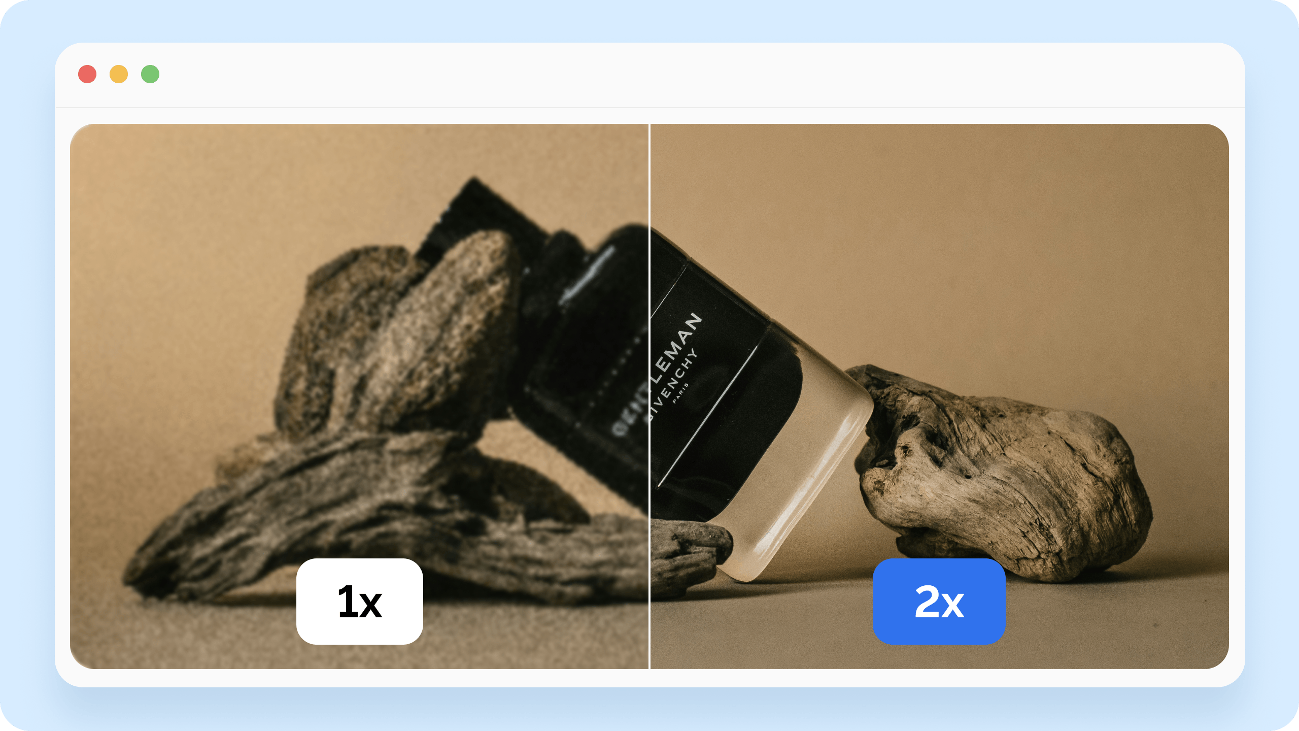
Half of subscribers open emails on Retina display devices — iPhone, iPad, MacBook, modern Android flagships. On these screens, regular images look blurry while the text stays sharp. It's noticeable, and it hurts the impression the email makes.
Let's break down why this happens and how to fix it.
What a Retina display is
Retina is Apple's marketing name for high-pixel-density screens. The idea is that each logical pixel maps to two (or more) physical pixels. This scaling factor is called the device pixel ratio (DPR).
A regular screen has a DPR of 1. Retina screens have a DPR of 2 or 3. That means a 300×200 pixel image takes up 600×400 physical pixels on a Retina screen. If the image only contains 300×200 pixels' worth of data, the browser or email client stretches it — hence the blur.

What this looks like in an email
Text in an email always stays sharp, since it renders as a vector object. Images don't. A logo, a banner, icons, product photos — these are all raster graphics that lose quality on Retina screens if they're not prepared correctly.
This is especially noticeable on logos and icons with thin lines — they look blurry even with otherwise good content.
How to prepare images for Retina
The basic principle is to create the image at twice the size it will display in the email, and then constrain its display size using HTML attributes.
If a banner takes up 600 pixels wide in the email, the source image should be 1200 pixels. In HTML, that looks like:
<img src=»banner.jpg» width=»600″ height=»300″ alt=»Banner»>
The browser displays the image at 600 pixels, but on a Retina screen it uses the full 1200 — and the image stays sharp.
For screens with a DPR of 3 (iPhone Pro, some Android devices), you'd need an image three times the display size. But in practice, doubling the size is enough for most devices.
Image weight and the trade-off
An image at twice the size weighs significantly more. This slows down the email's loading, especially on mobile internet.
The solution: compress images before sending. JPEG and WebP, with the right compression settings, give good quality at a small size. Compression tools: TinyPNG, Squoosh, ImageOptim.
A weight guideline: one banner — up to 150 KB, a GIF — up to 2.5 MB, the email's entire HTML code — up to 100 KB. Gmail clips emails heavier than 102 KB — that's a hard limit.
SVG instead of raster
For logos, icons, and simple graphics, it's better to use SVG — a vector format that looks equally sharp on any screen at any scale. SVG files are usually lighter than PNG.
The catch: not every email client supports SVG. Gmail on Android and some versions of Outlook don't render it. So for critical elements, it's best to keep a PNG fallback on hand.
How to check the result
The simplest way is to send a test email to an iPhone or MacBook and look at the images. If they look sharp, everything's set up correctly.
In Letteros, you can check how the email displays across different email clients right in the interface — including mobile devices with Retina screens — without sending a test email.

Checklist before sending
Images in the email are prepared at twice the size they'll display at.
The width and height HTML attributes are set to the actual display size.
Images are compressed — a banner up to 150 KB, the email's total weight up to 100 KB.
For logos and icons, SVG with a PNG fallback has been considered.
The email has been checked on a real Retina device or in the editor's preview.
Bottom line
Retina images aren't a complex technical challenge — they come down to one step: prepare images at double the size and constrain them via HTML. It takes a few minutes, and the difference in quality on modern devices is immediately noticeable.
Also read: