
An HR manager might spend hours on an email with important news, only to have it opened by just 15% of employees. The rest either won't notice the message or will delete it without reading. The problem is rarely the content — more often it's about how the email is written, designed, and technically prepared. Let's break down the rules that make internal newsletters truly readable.
Types and formats
Internal communications include various formats for working with the team. A newsletter's success depends on a precisely defined goal and a focus on the key message.
Email type | Goal | Key element |
|---|---|---|
Welcome series | Onboarding, first impression | Warmth + a clear next step |
HR digest | Inform without overwhelming | Structure and brevity |
Event announcement | Prompt action | One button, a date, the benefit |
eNPS / survey | Get feedback | Minimal text, maximum trust |
Process changes | Explain and ease concerns | Clarity and FAQ |
Congratulations | Build an emotional connection | Warmth, sincerity, no formalities |
For more on formats and scenarios, see the article “Creating a 2026 Corporate Newsletter Employees Definitely Won't Trash”.
The Voice of Internal Communications (Tone of Voice)
An email's tone directly affects how employees perceive the message. It can feel like friendly support or sound like a strict directive. For communication to be effective, internal newsletters usually rely on three key principles.
Simple. Explain even complex things clearly, as if you were telling a colleague in person. Avoid bureaucratic jargon and convoluted sentence constructions.
Supportive. Address the employee's pain points and questions. The email should show that you understand their difficulties and are offering a simple solution.
Expert. Speak in a natural, human voice. Don't use HR jargon — speak the language of the people you're writing for.
What to avoid
Mistake | Example |
|---|---|
Too many exclamation points | “Read this! Important! Urgent!” |
Bureaucratic jargon | “For informational purposes, we hereby notify you” |
Overblown tone | “Immerse yourself in the atmosphere of our one-of-a-kind event” |
“We” instead of “You” | “We've updated the portal” (better: “Now the portal is easier for you to use”) |
Filler text (“fluff”) | Abstract musings with no concrete benefit |
Generic CTAs | “Learn more”, “Find out” (better: “Sign up by Friday”, “Get the guide”) |
Content anatomy and structure
To keep the email from turning into a “wall” of text, use a proven block anatomy:
- Header with logo: for instant company recognition.
- Heading and subheading: should immediately highlight the topic's benefit.
- Intro text: no more than 3–5 sentences. State the topic or problem you'll help solve.
- Main banner: visual confirmation of the main idea.
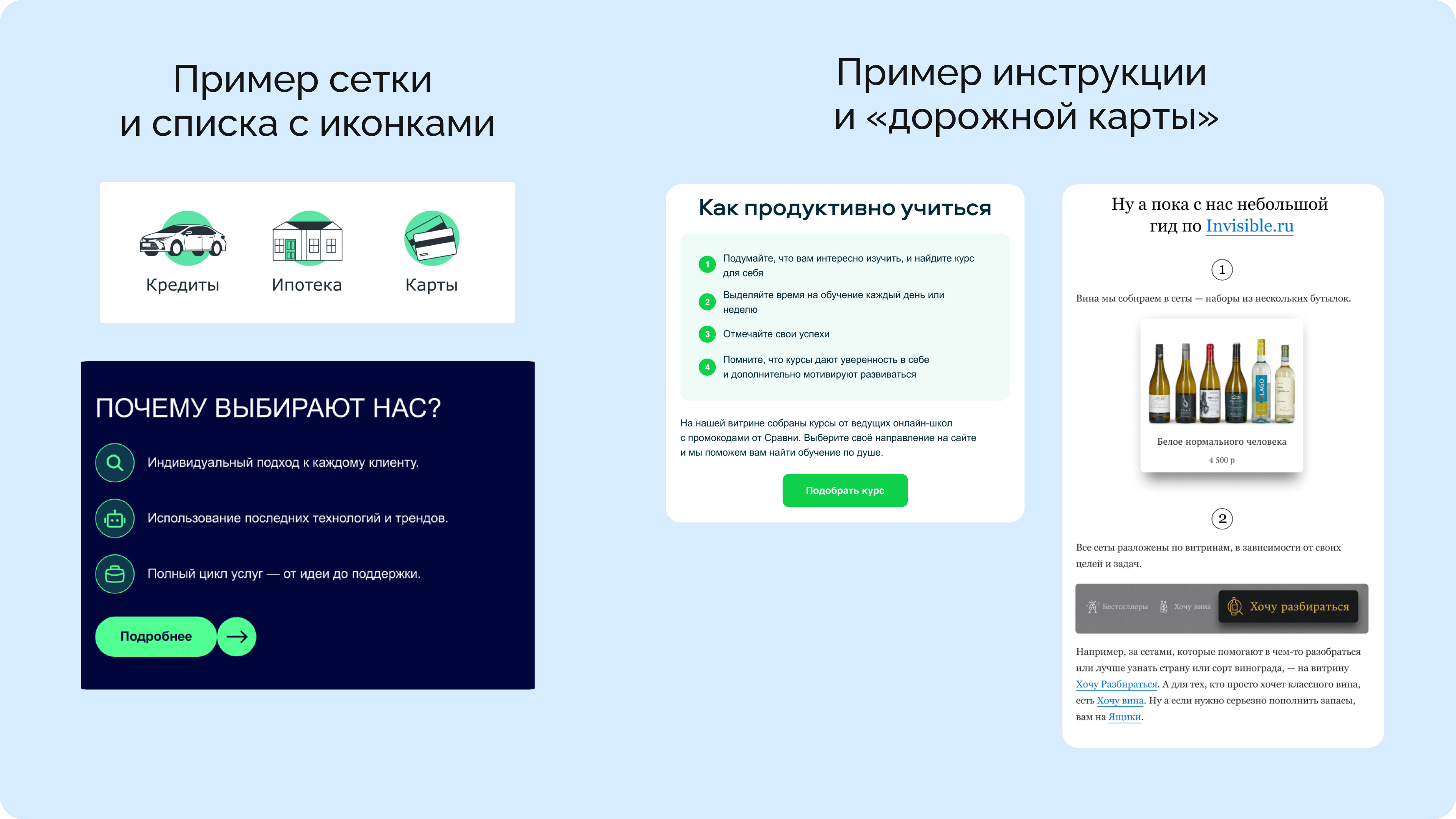
- Information blocks: unfold the topic gradually. Within a single email, it's best to use no more than two structural approaches (for example, an icon list and a “roadmap”).
- Button (CTA): should always contain an action verb.

How to assemble this structure in Letteros:
- Open the builder and choose a ready-made HR template from the library
- In the left panel, select the blocks you need — header, banner, text block, button
- Drag the blocks into the order you want and fill them with content
- Set your brand colors in the “Styles” section — they'll apply to all blocks at once
Subject line and preheader
The subject line determines the whole newsletter's open rate. To keep your message from getting lost in the inbox, follow three rules.
Length — up to 40 characters, so the text doesn't get cut off on smartphone screens.
Style — no “shouty” punctuation or all caps. Use specifics, numbers, and benefits.
Pairing — put the key information in the subject line, and reveal the details and benefit in the preheader.
Boosters — a time limit (“By the end of the week”) or a concrete benefit (“How to get your fitness reimbursement”).
Alt text as a safety net
Alt text is the image description that the user sees if the images don't load. In a corporate environment, this matters. In Outlook, images are often blocked by default. Without captions, an employee will see empty rectangles, and the first impression (for example, from a welcome email) will be ruined.

How to fill in alt text in Letteros:
- Click the image in the editor — a settings panel will open on the right
- Find the “Alt Text” field and enter a description of the image
- If you're not sure what to write, click the AI button next to the field, and a description will be generated automatically

Trends in HR communications
- Personalization by role. Different emails for newcomers, experienced employees, and managers. The same digest, but with different framing and emphasis.
- Situational relevance. Internal emails that respond to company events get read more than scheduled newsletters. A quick response to changes reduces anxiety on the team.
- Brevity. Employees read emails the same way they scroll a social media feed — skimming. The more structured the information, the faster it's absorbed.
- Hyper-care.Not “we updated the process”, but “we updated the process to make things easier for you”. All content is built around the employee's needs.
- Regularity. A predictable newsletter every two weeks beats a chaotic stream of emails. Regularity creates a sense of order.
Effectiveness metrics
How to tell that communication is working:
- Open rate. The benchmark for internal newsletters is higher than in marketing. If the open rate is low, the problem lies in the subject line or the sending frequency.
- Clicks on key links. Did people click through to the event recording, fill out the survey, open the document. This is a real measure of engagement.
- Unsubscribes and ignoring. A signal that something's off: too frequent, not relevant, unclear.
Checklist for a ready-made HR newsletter template
Before sending the email to employees, go through this list.
☐ The template is built on a master template with brand colors and logo
☐ All blocks use consistent fonts and spacing
☐ The email renders correctly in Outlook — checked via preview
☐ The mobile version is checked — text is readable, buttons are tappable
☐ Alt text is filled in for all images
☐ Dark mode is checked — buttons and text remain readable
☐ Links to documents, forms, and registrations work
☐ The CTA contains an action verb and sits above the fold
☐ The template is saved in the Letteros library for reuse
☐ The email is sent to the right segment — not to all employees at once
Pre-send checklist
☐ The subject line is clear without context
☐ The preheader doesn't duplicate the subject line, but reveals the benefit
☐ The email is checked in Outlook and adapted for mobile devices
☐ Dark mode is checked: buttons and text remain readable
☐ All links are clickable and work
☐ Alt text is filled in for all images
☐ The email is sent to the right segment of employees
☐ The text is broken into logical blocks (no “wall of text”)
☐ Buttons contain an action verb
☐ The main CTA is above the fold, no scrolling needed
☐ The visuals support the email's main idea
☐ It's clear what to do after reading
If you're already an expert in internal newsletters, check out Advanced Pre-Send Email Checklist: UX Design and Responsiveness.