
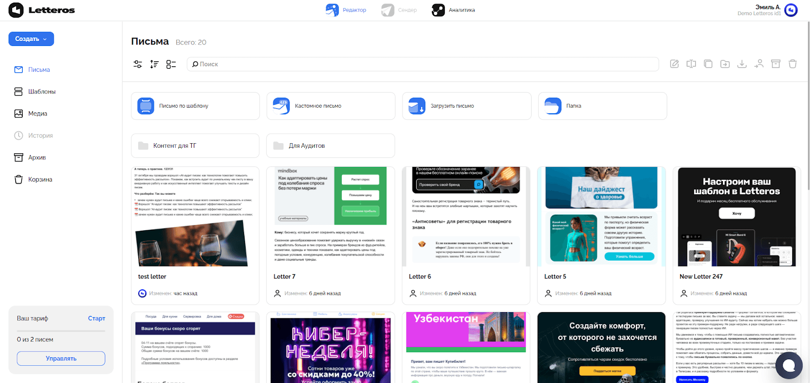
When you log into Letteros, you land in the workspace: the interface is designed so that all the tools you need are within reach and logically grouped.The dashboard sits at the center of the screen — your starting point. It shows your most recent emails and templates, and it's a convenient place to jump into creating a new email or continue working on layouts you've already started.

Navigating the Letteros home page:
Emails — a list of all your emails.
Templates — a list of all your templates.
Media — storage for uploaded images and files.
Archive — emails, templates, or media that have been archived.Trash — all files and folders that have been deleted.
Emails
The "Emails" section is the main workspace where all campaigns are created and edited.
Hovering over an email card reveals quick actions:
• view a preview;
• view the web version;
• go to editing;
• copy, move, or download the email
In addition, when you select an email an additional menu also appears with management buttons such as rename, move, upload, copy, archive, or delete.

Templates
The "Templates" section is a library where all the templates, blocks, and drafts used in emails are stored. It's structured the same way, but designed for working with base layouts and master templates.
Hovering over a template card reveals quick actions:
• view a preview;
• go to editing;
• copy, move, or download the template
Just like in the "Emails" section, when you select a template (by clicking its card), an additional menu also appears on the right with management buttons such as rename, move, upload, copy, archive, or delete.
Media
The "Media" section is storage for all the images and files uploaded into your emails and templates. Hovering over an image shows a preview, letting you quickly check a file without opening the email.
Quick actions:
• upload an image;
• folder;
When you select a media file, an additional menu also appears with management buttons such as rename, move, upload, copy, archive, or delete.
Unlike emails and templates, media files don't have an "Edit" button, since editing is done directly inside the editor when the image is inserted into an email.

Archive and trash
Both the "Archive" and "Trash" sections are designed for storing inactive emails, templates, and media files. Their interface is identical and helps you quickly restore items or delete them permanently.
The "Archive" section contains all emails, templates, and files that were moved there manually. It's a convenient way to hide materials that are no longer needed while keeping the option to bring them back to the workspace later.
The "Trash" section automatically receives all deleted emails, templates, and media files.
Hovering over an item shows a preview — you can check its content without opening the email.
The top right toolbar has these buttons:
• Empty trash / archive — delete all content.
• Display switcher — choose what to show: Emails, Templates or Media.
Selecting one or more items unlocks the following actions:
• Restore — bring the email or template back to the workspace;
• Delete — permanently delete the item.

Filters, sorting, and search
Filters let you quickly switch between item types. Depending on the section, these can include:
• "All / Emails / Folders" — for emails,
• "All / Templates / Folders" — for templates,
• "All / Media / Folders" — for media.
Sorting — changes the display order of items by name or date.
List view — you can choose to display items as cards (default) or as a list.
Search — a search bar for finding items by name, available in every section.

The "Create" button and creation options
Clicking "Create" shows you the following options:
— Email from a ready-made template: choose blocks from the template library, drop in your content, and adapt it to your brand.
— Custom email: start from a blank canvas and build the email with code.
— Upload an email / template: handy if the template or email was already built outside the platform.
— Folder: create a folder and organize your emails and templates by category.

On the "Emails", "Templates" and "Media" pages, creation buttons are also available right above the list, next to the search bar. From here, you can filter, sort, and create a new item without having to click the "Create" button.

The editor: the email creation interface
The editor is the main workspace where campaigns are created and edited.
You can open the editor by clicking the "Edit" button when hovering over an email.

The editor interface
Opening the editor takes you to a page with a visual email builder. Here you can add blocks, configure colors, fonts, images, and links, and instantly see how the email will look to the recipient.
Below, we'll take a detailed look at the editor interface, its main panels and tools, so you can work confidently with emails and quickly find the features you need.

The top toolbar
The top toolbar is the email control panel: it brings together the main commands and quick tools you'll need at every stage of your work.

"File" — this menu lets you manage the email: test how it displays on different devices, show or hide the subject line and preheader, create a copy of the email, lock it from editing, go to settings, or delete it if needed.
"Add" — quick access to inserting new elements and structures. Blocks in the library are organized into categories (text blocks, buttons, dividers, footer, etc.), so you can easily find and insert the element you need into the email in just a couple of clicks.
"Undo, Redo" — let you step back or forward through your action history.
"Version history" — the button with a clock icon. Lets you open a list of previously saved versions and roll back to one of them if needed.
"Save" — locks in the current version of the email. We recommend clicking it before leaving so you don't lose your changes.
The export button — lets you export the template in the format you need.
The exit button — takes you back to the site's home page.
The center of the panel holds the email's global settings: choosing a background color or image, setting link color, plus helper tools — a typography tool, spell check, and link check.
These settings define the overall style of the layout. Individual blocks have their own settings too — click the element you need to open them in the panel on the right.
The side panel
The side panel is a set of buttons that appear next to any block, letting you quickly manage its content and position.

The arrows icon: handles moving the block. Drag it to move the element to the spot you want with your mouse, or use the up and down arrows to shift the block by one position.
The "+" button — adds a new block right below the current one.
The double-page icon: creates an exact copy of the current block.
The code icon — lets you edit the HTML or copy the block's code. Useful for users who need to make manual changes or integrate the template elsewhere.
The trash icon — deletes the block.
The text block: creating and editing
To add text to an email, use the panel on the left.
1.In the top menu, click "Add" — a list of available modules will open.
2. In the "Text blocks" section, pick the text option you need.
3.You can add a block in two ways:
• Click "+" on the element you want — it'll appear in the email.
• Drag and drop the block onto the email canvas by holding down the left mouse button.

Text controls
Clicking a text block reveals additional toolbars above it for convenient text control.

Text style — sets the semantic format for a line or paragraph.
Font selector — switches the font family for the selected text.
Text size — adjusts the character size within the selection.
Formatting — standard emphasis options for highlighting important words or phrases.
Subscript/superscript — useful for chemical formulas, exponents, footnotes, and so on.
Text color — changes the main color of the selected text.
Highlight (text background) — highlights a word or phrase with color, handy for emphasizing key points.
Clear styles — resets the formatting of the selected text back to the base style.
Emoji — adds an emoji to the text.
Line spacing — controls the spacing between lines in a paragraph. Increasing line spacing improves readability, especially on mobile devices.
Add link — inserts or edits a URL for the selected text.
AI generation from a prompt — generates text based on a short prompt. Quickly suggests phrasing, headline, or CTA options.
Alignment — sets the horizontal alignment of the paragraph.
Important: changes apply only to the selected fragment, so you can set different styles for individual parts of the text within a single text block.
💡 Practical tips for working with text:
1. Always select a text fragment before applying a style — otherwise the change won't be applied.
2. Use no more than 2 fonts in an email. Mixing different fonts looks messy and can display incorrectly in email clients.
3. Sometimes text looks different visually than it does in the editor — especially if you've used different sizes and colors. Check how the email looks against a light and dark background, as well as in the mobile version
The image block
At the top, there's a minimal set of buttons:
"Update image" — replace the current image with a new one.
"Link" — insert or change a hyperlink.
If a link is already set, clicking the image opens a small popup where you can quickly update or remove the link without going to the top menu.

The image menu
Double-clicking an image opens an expanded settings menu.
Here you can:
• Replace the image — upload a file from your computer or paste a link. Supported formats are JPG, PNG, GIF, WEBP, and APNG (up to 32 MB).
• Check the parameters — image size, width (can be changed manually), and text for alt — a description of the image for cases when it fails to load.
• Configure the link — insert a URL, disable UTM tags, or make the image unclickable by checking the relevant box.
If an image is inserted via a link, you can choose the "Don't re-save the image to the CDN" option to use the original source.

The image editor
Clicking "Edit" in the image menu takes you to the built-in editor — a tool for basic image editing without third-party services.
Here you can:
• crop the image to the aspect ratio you need.
• adjust brightness, saturation, and contrast to improve how the image reads.
• add rounded corners for softer edges.
• remove the background if you need the image to be transparent.
After editing, don't forget to click "Save" to apply the changes.

Next section — Account and project settings