
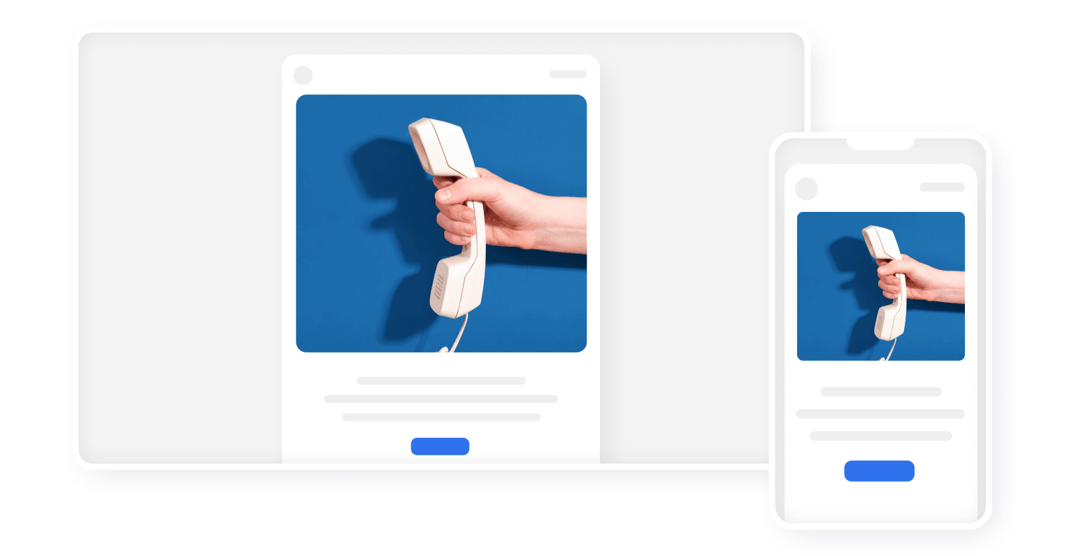
More than half of all emails are opened on a phone. Yet most templates are designed with desktop in mind, and the mobile version ends up however it ends up.
An email that looks great on a monitor and falls apart on a phone loses more than half its audience the moment it's opened.
Why the mobile version differs from desktop
A phone screen is 2–3 times narrower than a desktop screen. A 14px font on a monitor is readable. That same font on a phone is tiny. A 30px-tall button on desktop is normal. On a phone, a finger can't reliably tap it.
User behavior differs too. On a phone, people read email on public transit, on the go, with one hand. Attention is scattered, patience is low. If it's not clear what the email is about within the first two seconds, they close it.
Basic rules for mobile coding
Email width
The standard email width is 600px. On mobile, it collapses to the device's screen width (from 320px to 428px). Every element needs to scale correctly within that range.
For images wider than 300px, always set the width as a percentage with a max-width in pixels:
width: 100%; max-width: 600px
This lets the image take up all the available width on mobile without overflowing on desktop.
Font size
Element | Minimum size | Recommended |
|---|---|---|
Body text | 14px | 15–16px |
Headings | 20px | 22–28px |
Captions and fine print | 12px | 13–14px |
Gmail on iOS automatically bumps text smaller than 13px up to 13px. This breaks your layout if you don't account for it. To disable it: -webkit-text-size-adjust: none; on the html tag.
Buttons
The minimum tap target is 44x44px. This is the Apple Human Interface Guidelines standard. Users miss buttons smaller than this with their finger.
On mobile, it's better to stretch buttons across the full width — that way it's impossible to miss them, even on the go.
Column-based coding on mobile
Two or more columns on desktop should collapse into one as the screen narrows. This is called stacking — each block takes up 100% of the width and lines up vertically.
It's implemented with media queries and a CSS class that sets the width to 100% when the screen width is below 620px:
.mob_100 { width: 100% !important; }
This class is applied to blocks that should expand on mobile. Yandex Mail doesn't support media queries — the email will look like the desktop version there.

Dark mode on mobile
A significant share of iPhone and Android users have dark mode turned on. Email clients handle color inversion differently.
- Apple Mail and Outlook 2019 do a partial inversion: they swap a light background for a dark one, but leave images alone
- Gmail on Android can fully invert every color — brand blue turns yellow
What to do: prepare logos and icons as PNGs with a transparent background, check text contrast on a dark background, and test in dark mode before sending. In Letteros, the dark mode preview button is right in the editor.
More on dark mode: letteros.com/blog/sovety/temnaya-tema-v-email-kak-podgotovit-rassylku-k-dark-mode-i-ne-poteryat-chitatelej
What to check before sending
- Open the email on a real phone — not a browser emulator
- Check every button: can you tap it with your finger without missing
- Read the text without zooming in — is it readable
- Check it in dark mode — did the logo and text disappear
- Make sure images aren't cropped or stretched
In Letteros, testing across 100+ email clients is available right from the editor: letteros.com/blog/instructions/testirovanie-pisma