
Someone visits the website, picks out a product, puts it in the cart — and leaves. This happens 70–80% of the time. Maybe they got distracted by a phone call, were comparing prices in another tab, or had second thoughts at the last minute.
An abandoned cart email isn't a way to "chase down" a customer. It's a reminder that arrives while the person still remembers the product and possibly still wants to buy it.
The difference between a store that has set up this sequence and one that hasn't is revenue that quietly slips away.
Why one email is worse than three
Most stores send a single abandoned cart email. That's better than nothing, but significantly worse than a series of three touchpoints.
The logic is simple: different people abandon their carts for different reasons. For one person, a reminder is enough — they simply forgot. Another is unsure and waiting for an additional argument. A third needs a small financial nudge to decide.
A single email only covers the first scenario. A series covers all three.
The first email — one hour after leaving
The first email should arrive while the product is still fresh in mind. The optimal window is 30 minutes to two hours after the person left the cart.
This email's job isn't to sell. It's to gently remind. No pressure, no discount, no "only a few left in stock" if it isn't true.
The first email's subject line
The subject line should be neutral and friendly. Not a complaint, not urgency — just a reminder.
What works:
"You left something behind," "[Product name] is still waiting for you," "Come back — we saved your cart"
What doesn't work:
"You didn't complete your order" — sounds like a complaint.
"URGENT! Item running out!" — if this isn't true, you permanently lose trust.
"You forgot to buy it" — the person didn't forget anything, they just left.
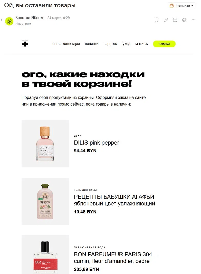
A "Zolotoe Yabloko" email. Subject line: "Oops, you left some items" — friendly, no pressure. Products shown large with prices, one button under each.

The first email's structure
The first email should be short. Long copy is unnecessary here — either the person remembers the product and just needs a reminder, or they don't.
A text heading — the point in one line, not baked into an image.
A large product photo — not a small icon, but a full-size image. Name and price as text next to it.
One button — "Return to cart" or "Claim my item," not "Buy."
No catalog at the bottom — one product, one action.
A "Moment" email. One product shown large, name, price, a dark "Return to cart" button on a light background. Below that — a short block addressing objections: warranty, returns, and the option to reply with a question. No extra content

A "Sportmaster" email. The product is shown too small, the SKU in the card is irrelevant to the buyer, and the all-caps "COMPLETE ORDER" button feels like a demand. Rephrasing it as "Return to your order" would immediately make the email softer. The structure is right, but the all-caps button feels pushy. The product is shown too small.

The second email — 24 hours later
If the first email didn't work, the person didn't just get distracted — they're weighing it. The second email's job is to give them an extra argument to help them decide.
This is where you can step it up: show the product from another angle, add reviews or a rating, mention the actual stock level if it's genuinely low. No discount yet.
The second email's subject line
"X people are looking at this item right now," "Only 3 left — in case you're still deciding," "Other customers are talking about [product name]"
Social proof in the subject line works because it lowers perceived risk. The person sees that other people are choosing this product too, so the decision feels less complicated.
What to add to the second email
Reviews — 2–3 short ones with a rating, not long walls of text.
The product rating — stars and the number of ratings next to the photo.
Stock level — only if it's genuinely low; "47 left in stock" creates zero urgency.
An answer to a likely objection — free returns, warranty, shipping.
A Whisky Loot email. For a niche, high-ticket product, the email addresses doubts through an FAQ instead of pushing urgency. "Still thinking about it?" is a subject line that doesn't judge — it understands.

The third email — 72 hours later
The third email is the final one. If the person hasn't responded to the two previous ones, they either have serious doubts or need one last push in the form of a concrete benefit.
This is where a discount or free shipping makes sense — if your margin allows it. But only here, not earlier.
Why you shouldn't offer a discount in the first email
This is the most common mistake in setting up the sequence. A store offers a discount in the very first email — and a few months later notices that customers have started deliberately abandoning their carts.
The mechanics are simple: if people know a discount will follow an abandoned cart, they start using that as a tactic. The discount stops being an incentive and becomes a required condition for buying.
A 21vek.by email. A discount promo code right in the first email, no warm-up. Customers quickly learn that the discount will come no matter what.
The third email's subject line
"Last chance to grab [product name]," "Only until end of day — 10% off your cart," "Here's a promo code, just for you"
The third email's structure
The product — shown large again, with the price before and after the discount.
A specific deadline — "promo code valid until 11:59 PM Sunday," not "limited-time offer."
An automatic discount applied via a link works better than a promo code — a promo code requires an extra step.
A button with specific text — "Claim my 10% off," not just "Buy."
After the third email
Three emails are enough. A fourth or fifth reminder about the same cart turns into harassment, not care. The person has seen the emails and decided not to buy — or bought somewhere else.
If there's no response after the third email, close the cart and move the person into your regular list segment. If they're an active subscriber, keep sending regular campaigns. If not, they go into the reactivation queue.
Technical details people forget
The email needs to read fine without images
Gmail blocks images by default for new senders. If the entire email is one big banner, the subscriber sees an empty white space.
A Le Tote email, where almost the entire first screen is a photo of a stack of clothes, with text appearing only further down. Turn off images, and the email loses all meaning before the reader ever scrolls to the text. The heading, product name, price, and button need to be real markup, not part of an image.
One cart — one series
If a customer abandons a cart, buys something else, and then abandons another cart, that's a new email series, not a continuation of the old one. Track cart status and don't send emails about a cart the customer has already purchased.
Personalization by name
Addressing someone by name in the subject line boosts OR by an average of 10–15%. An email with a name feels less like a mass send.
An OZON email. Addressing the customer by name in both the subject line and the text: "Hello, Valeria!" — it immediately feels like the email was written personally for them.

Quick summary: what to check before launching
Three emails, not one. Timing: 1 hour, 24 hours, 72 hours.The first email — no discount, a reminder rather than a sales pitch.
The discount — only in the third email, and only if your margin justifies it.
The subject line — no accusatory tone or all caps, friendly and specific.
The structure — one product, one button, text separate from images.
The deadline — a specific date and time, not "limited-time offer."
After the third email — let it go, a fourth email is already too much.
You can set up an abandoned cart email series and build templates for each stage in Letteros — the modular editor lets you quickly assemble all three emails in a consistent style and connect them to your ESP without a developer.