
An effective product card combines a visual, a price, and a call to action in one functional block. This format turns an email into a convenient showcase where the buyer has everything they need to make a decision right at hand. For a marketer, a well-designed template is insurance against mistakes and a way to put together campaigns far faster.
In this article, we'll break down how to "build" the perfect product card, how to set up automatic data pulling in Letteros, and when auto-parsing beats manual assembly.
What makes up a product card in an email
A good card includes five essential elements. Remove any one of them and you lose conversion.
Image. The first thing the eye catches. The reader sees the photo before reading the name. Without it, the card turns into a boring price list.
Name. Short and clear — up to 60 characters. No warehouse SKUs or codes that only confuse the buyer.
Description. One or two key properties that matter to a person: not "600D polypropylene", but "doesn't get wet in the rain and holds up in freezing temperatures". The email doesn't replace the website — all it needs to do is grab attention.
Price. The current price and the old one struck through (if there's a discount). This works better than any text about a "great deal".
CTA button. One product, one button. The link should go straight to that product's page, not to the general catalog.
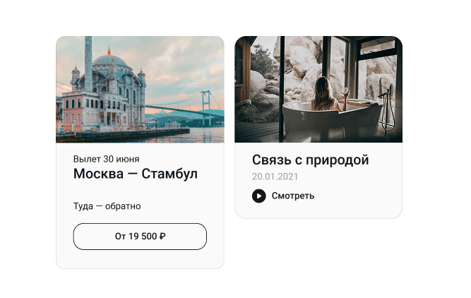
Here's an example of how the cards look in a real email.The first one has the full set of elements: image, name, description, price in the button.The second one is a shortened version: just an image, name, and link.Notice: the button on the left card includes the price right in the text ("From ₽19,500") — this is stronger than a plain "Buy", because the reader sees the offer before even clicking.

There's also a common problem visible here: the cards have different image proportions — the left one is nearly square, the right one is stretched horizontally. In a campaign with several cards in a row, this breaks the grid. We'll cover how to avoid this in the section on common mistakes.
Rules for designing each element
Image
The proportions of all images in one campaign should match — otherwise the card grid will fall apart. A square (1:1) or 4:3 format is optimal. The minimum resolution is 600×600 pixels, otherwise the image will look blurry on Retina screens. For photos, use JPG or WebP; PNG only if the product has a transparent background.
What's better to avoid: using screenshots from the website, photos with watermarks, or cramming collages into one small card.
Price
Make the price larger than the body text. If there's a discount, place the old price next to it and strike it through. If you're selling sets or items sold by weight, always specify the unit of measurement.
An important nuance: email isn't a website. The price in an email "freezes" at the moment it's sent. If the product's price changes an hour after sending, the email will still show the old figure. This is a technical limitation of the email format itself, not a service error.
CTA button
Weak | Strong |
|---|---|
"Click here" | "Buy" |
"Learn more" | "Add to cart" |
"Link" | "View product" |
"Go" | "Get the discount" |
Don't make the user choose. Two buttons ("Buy" and "Description") under one product only scatter attention and lower the odds of a click.
Auto-parsing vs. manual filling
Data can be added to cards in two ways: manually or via auto-parsing. The difference is significant, especially when there are a lot of products.
Criterion | Manual filling | Auto-parsing |
|---|---|---|
Preparation speed | Slow: every field copied by hand | Fast: data is pulled automatically |
Number of products | Manageable up to 5-10 items | Manageable for any number |
Risk of errors | High: typos, outdated prices, broken links | Low: data comes straight from the source |
Data freshness | Depends on the editor's attentiveness | Current as of the moment the import runs |
Setup | No preparation needed | Requires a one-time setup of the template and source |
Scaling | Effort grows linearly with the number of products | Effort doesn't depend on the number of products |
Updating after sending | Not possible either way | Not possible either way |
In practice: if you send product campaigns regularly, auto-parsing pays for itself from the very first send. Manual assembly only makes sense for one-off emails.
How auto-parsing works in Letteros
Auto-parsing in Letteros automatically transfers data from the website into the email's blocks while you're preparing a campaign. No manual copy-pasting: the name, price, image, and link are pulled in on their own based on predefined parameters.
A quick rundown of how it works:
- Letteros specialists build the block's layout in the master template once, defining all the parameters that need to be pulled in.
- The data source is a page on the website or a file with product data.
- Data is captured at the point the email is prepared. Once it's sent, dynamic updates are no longer possible.
- No changes to the Letteros product itself are required — just a one-time template setup and connecting the source.
How to set up auto-parsing: a step-by-step guide
Step 1. Prepare your website
Before setting up parsing, make sure the website technically allows it.
Check page accessibility. If the site has bot protection (a CAPTCHA, Cloudflare browser checks), the parser won't be able to get the data. Check with your developers whether there are restrictions in the robots.txt file.
Make sure data delivery is stable. Product pages should load without errors and return full HTML — not a "loading via JavaScript" placeholder.
Add clear CSS selectors or data attributes. This is the key technical requirement. Every field you need to pull in must have a reliable CSS selector or attribute in the markup. Typically you'll need:
- the product name,
- the current price,
- the old price (if any),
- the image link,
- the product page link,
- a short description.
To illustrate, here's a simplified example. A product page's code has roughly this structure:
<div class=»product-card»>
<h1 class=»product-title»>Pro X Wireless Headphones</h1>
<img class=»product-image» src=»/images/headphones.jpg»>
<span class=»product-price»>₽5,990</span>
<span class=»product-price-old»>₽7,490</span>
<p class=»product-description»>40 hours of battery life</p>
<a class=»product-link» href=»/catalog/headphones-pro-x»>View product</a>
</div>
In that case, the CSS selectors for the parser would be:
Field | Selector |
|---|---|
Name | .product-title |
Image | .product-image |
Current price | .product-price |
Old price | .product-price-old |
Description | .product-description |
Product link | .product-link |
Every website has its own markup — the classes and tags will be different. It's the website developer's job to make sure every field you need has a unique selector that the parser can always use to find the right element. If the markup doesn't allow for this, ask the developers to add data attributes, for example, data-product-name, data-product-price.
Step 2. Set up the master template in Letteros
Letteros's coders will build the card block. It's set up with the logic: which field goes where and how the price should be formatted (for example, so that 5990.00 turns into a clean ₽5,990). This is a one-time task that later saves hours in every campaign.
Step 3. Connect the data source
In the Letteros interface, open the data parsing section. Paste the link to the source — this could be a catalog page on the website, a single product page, or a data file (for example, an XML feed or CSV).
Once connected, the parameters from the master template are automatically matched to the source's fields. Make sure all the needed fields were picked up correctly: check for empty fields or ones filled in unexpectedly.
Step 4. Run a test import and check the data
Always run a test import before the final campaign preparation. Afterward, check every card manually:
- prices are current and formatted correctly (not "5990.00", but "₽5,990"),
- images load and aren't cropped,
- names don't contain service characters and aren't truncated,
- links lead to exactly the product the card is tied to.
Only prepare the campaign for sending after this check.
A detailed step-by-step guide to setting up product card parsing in Letteros
Card layout: grids and mobile devices
Nearly 70% of people read emails on their phone. Even if your card looks great on a monitor, that doesn't mean it will be easy to tap with a finger on the go.
How many cards to put in a row
The number of columns depends on the type of product and how much information is in the card.
Grid | When to use it |
|---|---|
1 card per row | A premium product, lots of text, a large image matters |
2 cards per row | A universal option — works well on both desktop and mobile |
3-4 cards per row | Desktop only, simple products with minimal text |
Three layout options for a single product: a wide banner, a horizontal card, and a grid of two vertical cards. The choice depends on the number of products and the available space in the email.

How cards adapt on mobile
On a narrow screen, a multi-column grid collapses — two columns become one, four become two or one. This behavior is set in the master template's layout via media queries. If responsiveness isn't configured, the cards will be tiny and unreadable on a phone.
What's important to check on mobile before sending:
- the image isn't cropped or shrunk to an unreadable size,
- the name and description text doesn't wrap awkwardly,
- the button is big enough to tap with a finger — at least 44×44 pixels,
- the price is easy to read without zooming in.
The easiest way to check is right in an email client on a phone, or using the mobile preview mode in email testing services.
Common mistakes when working with cards
Incorrect CSS selectors. The parser picks up the wrong field or doesn't find the data at all. How to avoid it: check the selectors against several different products, not just one example — the markup structure can differ between pages.
No check before sending. Prices from a stale cache, broken image links, truncated names — all of this only surfaces once the email has already gone out. A test import and manual review of the cards is mandatory.
Different image proportions. One card with a square photo, the next with a stretched one — the email's grid breaks. Agree on a single image format at the template preparation stage.
Expecting a dynamic update. Parsing captures a snapshot of the data at the moment the campaign is prepared. If the price changes after sending, the reader will see the old data. If you need live prices in an already-sent email, that requires a different technology — AMP emails or a link to a live landing page.
A weak or neutral CTA. A "Learn more" button doesn't tell the person what happens after they click. "Buy", "Add to cart", "View product" are verbs that convert.
Errors in the master template's markup. If the template is built with mistakes during initial setup, they'll repeat in every campaign. Carefully check the template once together with Letteros specialists.
A checklist before sending a card-based campaign
◻ Images are the same size and proportions, and load without artifacts
◻ Prices are current as of the send
◻ Product names aren't truncated and don't contain service codes
◻ Descriptions are readable and don't look like technical text
◻ Every button links to the correct product page
◻ UTM tags are set on the links
◻ The email has been checked on mobile and in a desktop client
◻ A test import has been run and all fields are filled in correctly
Bottom line
A product card works when each of its five elements does its job: the image attracts, the name identifies, the description convinces, the price shows the value, and the button converts. Auto-parsing lets you assemble these blocks quickly and without mistakes — especially when there are many products and campaigns go out regularly. The key is to set up the master template correctly once, connect the data source, and never skip checking the import before every send.