
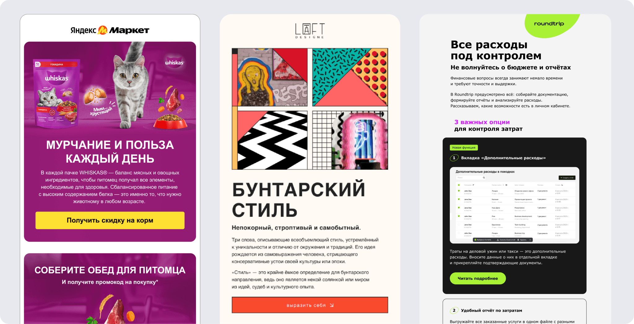
In our previous article we covered the basics: how to code an "unbreakable" button, what spacing to keep, and why a CTA should never be an image. But even a perfectly coded button can turn out useless if it doesn't account for user psychology and device context.
Let's break down advanced techniques that turn an ordinary button into a powerful sales tool.
Visual triggers for guiding attention
The right button design works on a subconscious level: it sets the mood and directs the user's gaze before they even read the text. To make sure your button doesn't get lost in the email, use these proven techniques:
Color contrast and the isolation effect (the Von Restorff effect)If the whole email is done in calm, corporate tones, the button should be that one bright spot that instantly draws the eye. It's a signal for where the most important action is.
Negative spaceThe button should have "plenty of breathing room" around it. The more free space around a CTA, the more significant and clickable it feels. Clutter near the button, on the other hand, lowers its perceived value in the reader's eyes.
Matching expectationsThe color you choose should match the message's meaning. For order confirmations or service sign-ups, calm blues or greens work better, since they build trust. For hot sales and promotions, bright orange or red works better, since they encourage quick action.

The anatomy of copy and the power of microcopy
When a standard call like "Buy" or "Sign up" feels too dry or demanding, use microcopy (a caption below or next to the button). Its job is to lower the barrier to entry and dispel the user's last doubts right at the moment of the click.
Use these three proven approaches:
Removing objections and fears
Readers are often afraid to click a button because they expect a complicated sign-up or a charge to their card. Microcopy like "Cancel anytime," "No card required," or "Takes just 2 minutes" removes that barrier.
Urgency and scarcity triggers
If a promotion is limited, the button should communicate that. Captions like "Only 5 spots left at this price" or "Promo code expires in 3 hours" nudge people who are putting off the purchase into acting now.
Personalization through "I" phrasing
Try shifting the focus from the system's action to the user's desire. Instead of the generic "Start the course," use "I want to become a PRO designer." When the text on or below the button is written from the reader's perspective, click-through conversion is usually higher.

Button hierarchy
Often, a single block in an email needs to offer two different actions: for example, "Buy now" and "Browse the catalog." The main mistake is making these buttons visually identical. When elements carry equal visual weight, the user's gaze gets "blurred," and they might not click either one.
To guide the reader, use a priority system:
The primary button
This is the main goal of your email. It should be as noticeable as possible: filled with a bright color, sizable, and grabbing 80% of the attention. It literally says: "Click here first."
The secondary button
This is for people who aren't ready to buy yet but are interested. It's best styled as a "ghost button" (an outlined border with no fill) or a plain text link.

Tip: Don't place two filled buttons of the same color next to each other. This creates "choice paralysis." The user spends extra fractions of a second deciding which one matters more, and often just closes the email.
CTAs for the "lazy" and mobile ergonomics
A minimum button size of 44px is the standard, but that alone isn't enough for high conversion. You need to account for the "thumb zone." The area of the screen that's easiest for a user to reach when holding a smartphone with one hand.
The magic of centering
On smartphones, centered buttons get clicked on average 15% more often. The reason is simple: the center of the screen is equally easy to reach with the thumb of either the right or left hand. Meanwhile, a button in the corner forces users to shift their grip or use their other hand, which interrupts the reading flow.
Full-width buttons
While a stretched-out button looks bulky on desktop, on mobile it's a real lifesaver. A full-width button becomes a "safe target" — it's practically impossible to miss, even on the go.

For more on how email design affects conversion, read our article
What actually drove the click?
If your long email has three identical buttons (at the top, middle, and bottom), standard analytics will only show you the overall CTR. To understand which block performed better:
Detailed UTM tags
Don't duplicate links. Add unique values to the utm_content parameter: button_top, button_middle, button_footer. That way, in Google Analytics you'll see which part of the email performs best.
Click heatmaps
Use visualization tools that show the "hot" zones of your email. This helps you understand whether users are skipping important blocks and whether they're noticing the button at all.

A/B testing wording
Test the "verb vs. outcome" hypothesis. For example, compare click-through for "Get a discount" (an action) versus "I want a gift" (a desired outcome). Sometimes swapping a single word boosts conversion by 10–15%.
To know exactly which button in a long digest drove a sale, use unique parameters for every link. Learn How to Automate Adding UTM Tags to Emails
Dark mode for buttons
Many people forget that in Dark Mode, email clients forcibly invert colors. This can turn your perfect design into an unreadable smudge.
The problem: A dark blue button on a white background often turns into a dark blue button on a dark gray background after inversion. The contrast disappears, and the button literally "dissolves" into the interface.
The solution: Add a thin light border to your buttons, 1–2 pixels wide. In light mode it's practically invisible, but in dark mode it clearly outlines the edges. For advanced coding, use @media (prefers-color-scheme: dark) media queries to reliably keep the colors you want.

To make sure your buttons and logos don't fall apart, check out our article — Dark Mode in Email: How to Prep a Campaign for Dark Mode Without Losing Readers.
How to implement this in Letteros
In the Letteros builder, you don't need to write code for Outlook or mobile devices. Just drag a button into the layout, set its type and spacing in the visual editor, and instantly check how it looks in dark mode via the preview.