
A pre-order email tackles several tasks at once: it captures audience interest before the official launch, builds hype, and gives the company data on demand. But this only works with the right structure and delivery. Let's break down how to design an email like this so it converts.
When you need a pre-order email
Pre-orders aren't just for e-commerce. They're used across a wide range of niches.
Online stores launch pre-orders for new collections, limited editions, or items that are temporarily out of stock. Online schools collect pre-orders for new courses before the program is fully ready. SaaS companies open early access to new features. Publishers take pre-orders for books before the print run comes out.
In every case, the logic is the same: someone pays or reserves a spot now to get the product first or at a special price.
The structure of a pre-order email
A pre-order email is built differently from a regular promo. The main task is to convince someone to act before the product fully exists. That takes more trust and more specifics.
The headline. It should immediately signal this isn't a regular promotion. "Pre-orders are open," "Reserve your spot first," "For those who make it in time" — the headline sets the tone for the whole email.
What's actually being offered. Describe the product in detail: what it does, how it differs from existing alternatives, why it's worth waiting for. The less well-known the product, the more detailed the description should be.
When it will be available. A specific date or window. "Soon" doesn't work — people need to know how long they'll be waiting.
What someone gets for pre-ordering now. This is the key element. A discount, an exclusive bonus, priority shipping, early access — there needs to be a real reason to act now instead of later.
How long the offer lasts. A deadline or a limited number of spots. Without this, a pre-order loses its urgency.
One button with a clear action. "Pre-order now," "Reserve your spot," "Get early access" — a verb plus specifics.

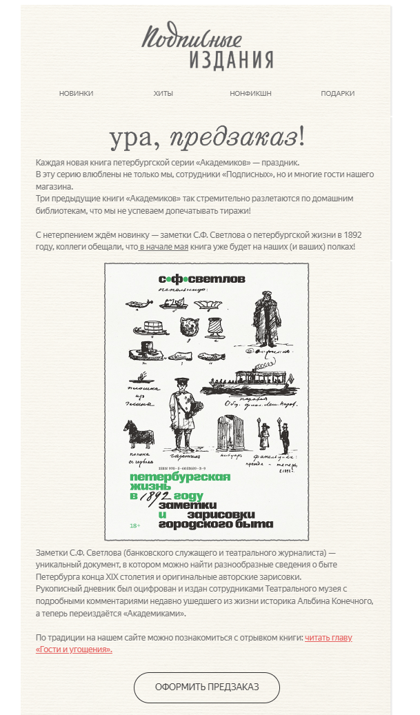
Subscription Editions announces a pre-order for a new book — a lively headline, a description with the product's story, the cover, and one action button.
A series of emails, not just one
A pre-order rarely closes with a single email. It's more effective to build a short series.
Email 1. The teaser. Let people know a pre-order is coming soon. Explain what the product is and why it exists. Don't sell — build anticipation. Offer to sign up for a notification or join a waitlist.
Email 2. The pre-order opens. A detailed email with full information about the product, the pre-order terms, and the deadline. This is where the concrete call to action goes.
Email 3. The reminder. A day or two before the pre-order closes. Keep it short — the deadline, the number of spots left, or the last chance to get the bonus.
Email 4. Confirmation. For people who pre-ordered — what happens next, when to expect it, how to track the status. This reduces anxiety and support requests.

IKRA announces its conference participation ahead of time — a specific date, the program, and a 45% discount until March 13. A classic example of the first email in a pre-order series.
How to showcase a product that doesn't exist yet
This is the main challenge of a pre-order email. The product isn't finished, so you can't show it off in all its glory. But there are a few ways to build a compelling visual.
A render or concept art. For physical products — a 3D render or a polished concept. For courses — the curriculum or module structure as an infographic.
The making-of process. Photos or video from behind the scenes — how the product is made, who's working on it. This builds trust and fuels interest.
Beta tester reviews. If the product has been tested, even a few quotes from real people persuade better than any description.
Numbers and facts. How many people are already on the waitlist, how long development took, what problem the product solves and for whom.

Subscription Editions shows the book before release through photos of its spreads — the reader sees the design and content. The date and a 15% discount give a concrete reason to pre-order now.
Common mistakes in pre-order emails
No clear deadline. If the pre-order is open "until spots run out" with no specific date, the reader puts off the decision. Set a date — even if it's approximate.
Too much information. A pre-order email shouldn't try to explain everything. Its job is to spark interest and direct people to a page with the details. A long email packed with technical specs doesn't get read well.
The pre-order bonus isn't obvious. If the advantage of pre-ordering now isn't obvious within the first few seconds, conversion will be low. Highlight it visually and put it near the top of the email.
No confirmation email. Someone places a pre-order and gets nothing back in response. This creates anxiety and support tickets. An automatic confirmation email with "what happens next" information is a must.
One email instead of a series. A single announcement rarely drives enough conversions. At minimum, you need three touchpoints: the teaser, the opening, and the reminder.
What to write in the subject line
A pre-order email's subject line should create a sense of exclusivity and urgency without manipulation.
What works: "Pre-orders are open — 47 spots left," "Subscribers only: early access to [name]," "[Name], you're hearing about this first," "Pre-orders close Friday."
What doesn't work: "A special offer just for you," "Don't miss out," "Hurry — buy now."
Bottom line
A pre-order email works when it has a real reason to act now, a specific deadline, and a clear next step. A series of three or four emails is always more effective than one. And a confirmation email after the pre-order is placed is a must-have element that reduces buyer anxiety and support load.
Also read: