
The header is the first thing a reader sees after opening an email. It has two jobs: to show who the email is from, and to set the right tone. When the header is done well, the reader instantly understands where they are and keeps reading. When the header is missing or sloppy, the email loses recognizability and trust.
What goes into a header
The header is the top block of an email, above the main content. It usually includes several elements.
Logo. The main element of the header. The reader sees the logo and instantly knows who the email is from, even before reading the subject line or the first sentence.
Navigation menu. Links to the main sections of the website or catalog categories. Used in newsletters from online stores and media outlets. Helps the reader go straight to where they need to be.
Web version link. A small "View email in browser" line for readers whose email displays incorrectly. Usually placed above the logo.
Tagline or newsletter description. A short phrase under the logo that reminds the reader what this newsletter is about. Especially useful for content and news newsletters.
Not every element is needed in every email. For transactional emails, a logo is enough. For an online store's promo newsletter, both a menu and a logo make sense. For a personal author newsletter, the author's name and photo work best.

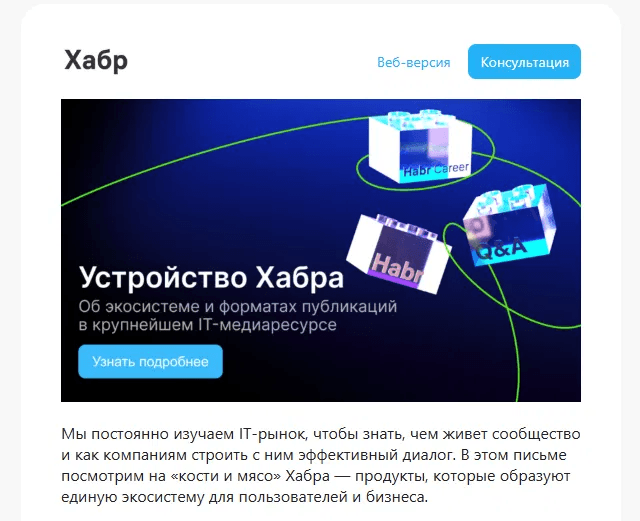
Habr's header — logo on the left, a web version link and a "Consultation" button on the right. Navigation in the header leads to a specific action, not just to the homepage.
Dimensions and technical parameters
The standard email width is 600 pixels — the header should fit within this size.
Header height depends on its content. For a logo only, 80–120 pixels is enough. With a navigation menu — 120–160 pixels. A header that's too tall eats up valuable space at the top of the email, which the reader sees first.
It's best to prepare the logo at double resolution for Retina screens. If the logo is 200 pixels wide, the source file should be 400 pixels and constrained via the width attribute in HTML.
Logo format: PNG with a transparent background if the header is colored. SVG doesn't work — it's not supported by all email clients.

The header of the "Chestno" newsletter — a handwritten logo and a tagline beneath it. The author's personal style creates recognizability without a corporate design.
Header color and background
The header sets the visual tone for the entire email. Three approaches that work.
White background. A universal option. A logo on a white background looks neutral and doesn't compete with the email's content. Works well for content newsletters and B2B.
Brand color. A header in the brand color instantly creates recognizability. It's important to make sure the logo is legible against this background and that the color isn't too heavy — otherwise the header will overwhelm the whole email.
Dark background. Works for brands with a dark identity. Requires separate testing in email clients' dark mode — colors may get inverted.
Whichever option you choose, test the header in dark mode. A logo with a transparent background can become invisible against a dark backdrop if it's a dark color.
Navigation menu in the header
Navigation in the email header isn't always appropriate. It works well in online store newsletters, where the reader is used to seeing it and uses it to quickly jump to the right section.
In content and transactional emails, navigation distracts from the main action. If an email is meant to drive one specific goal, extra links in the header lower conversion.
A few rules for header navigation.
No more than 4–5 items. Any more and the header becomes cluttered, and on mobile the items won't fit in one row.
Use a font smaller than the email's main text, usually 12–13px. The menu shouldn't compete with the headline.
On mobile, navigation is often hidden or wraps into several lines — check how it looks on a narrow screen.

The "Podpisnye Izdaniya" header — a logo and four navigation items for catalog categories. The reader can jump straight to the section they need.
Headers for different types of newsletters
Online store promo newsletter. Logo centered or on the left, a navigation menu with main categories, a brand-colored or white background. The header is minimal — the main focus is on the offer banner.
Content and news newsletter. Logo or newsletter name, a short tagline or issue description, sometimes an issue number. The header sets the editorial style.
Transactional email. Logo only. No menu or taglines — the email delivers important information, and the header shouldn't distract from it.
Personal author newsletter. The author's name, photo, and a short description. A personal style works better than a corporate logo when the newsletter is built on a personal brand.
B2B newsletter. Logo, sometimes the company name as text next to the logo. Minimalist and professional.

Sendsay's header — a centered logo on a white background, no navigation or extra elements. Clean and recognizable.

Central University's header — a logo and banner with no navigation. All attention goes straight to the headline and the substance of the offer.

Timeweb Cloud's transactional email — a branded blue block with a logo and headline. The header instantly communicates the brand and the point of the email.
Common header mistakes
Logo too big. A logo spanning the full width of the email looks heavy and eats up space. The optimal logo width is 150–250 pixels.
Logo without a link. The logo in the header should link to the website. This is a standard reader expectation — they click the logo and land on the homepage.
No alt text on the logo. If images are disabled, the reader sees an empty block instead of the logo. Alt text with the company name solves this problem.
Inconsistent header across emails. If the header changes from newsletter to newsletter, the reader never builds a visual habit. The header should be a stable element, consistent across all of a brand's emails.
Header not adapted for mobile. On a narrow screen, the logo may scale oddly and the menu may wrap or break. Test the header on a mobile device or in the editor's preview.
Summary
A good header is a linked logo that's legible on any background and in dark mode, the navigation you actually need and nothing more. It should be recognizable at a glance and shouldn't pull attention away from the email's main content. Lock the header into your master template once, and it will work across every newsletter without extra effort.
Read also: