
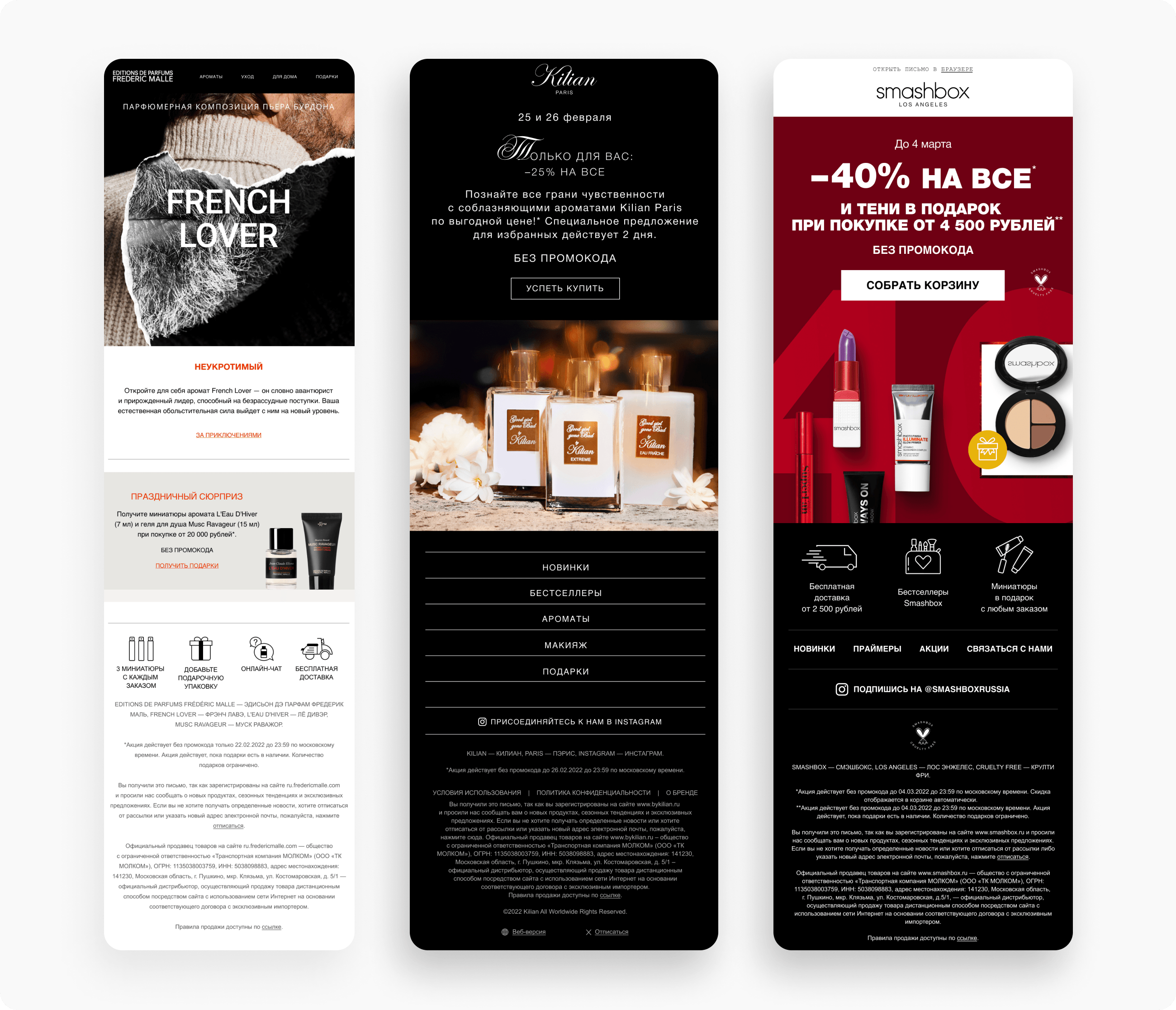
In this article, we'll explain how to use design to guide the reader's eye so they immediately notice what matters and click through.
How the visual layer drives behavior
In email marketing, "scanning" is what happens first: users evaluate the shape, size, and contrast of elements before they start actually reading the text.
- Reading patterns: Emails follow the same F- and Z-shaped eye-tracking patterns as other content. If your key offer doesn't fall within these zones, conversion drops. To dig deeper into the technical side of things, check out our step-by-step guide to email markup.
- Technical barriers: Email clients limit CSS and can block images. The design needs to stay functional even when the markup "breaks."
7 visual techniques to boost clicks
1. Build a linear structure
Complex "carousels" and chaotic blocks overwhelm the user. A clear sequence works best: The point → the benefit → the proof → the CTA. To avoid critical mistakes in your email's structure, check out our article: 8 email design mistakes that kill conversion.

2. Focus on the first screen
This is where it gets decided whether the reader will scroll further. The essential set: a headline with the benefit, one strong visual, and a CTA button visible without scrolling.
Moving the CTA above the fold increases clicks by 10–25%. Take a look at examples of effective design rules to strengthen this block.

3. Fine-tune typography and content
Typography influences a user's decision more strongly than images do.
- Headlines: 22–32 px.
- Line length: 40–55 characters (ideal for focus).
- Copy: Even perfect design can't save a weak offer.
Related guide: Typography in email: how to choose a font that won't "break".
4. Set up emphasis and hierarchy
The eye should follow the path you've designed. Use contrasting zones and directional elements. To learn how to professionally manage your color palette, read the article "How to Work with Color and Contrast in Emails the Right Way".
5. Optimize buttons and CTAs
One clear call to action in a block gets more clicks than three different ones. Short button text always outperforms long phrases.
Useful resource: A guide to creating effective CTAs, with examples.
6. Mobile adaptation
Up to 80% of emails are opened on smartphones. Make sure:
- Buttons are at least 44 px tall (for a thumb tap).
- Font size is at least 14–16 px.

Technical breakdown: A lesson on mobile adaptation for email developers.
7. Dark theme
Up to 60% of users have dark mode enabled. If you don't account for color inversion, logos can "disappear." We've prepared a guide: "How to Prepare Your Campaign for Dark Mode Without Losing Readers".

Analytics and A/B tests
To see how design affects results, track CTOR (the ratio of clicks to opens). For the data to be accurate, it's important to run experiments correctly. Read more about split testing in email marketing.
Testing rules:
- One hypothesis at a time: change either the button color or the headline, not both.
- Representativeness: run the test for 3–5 days on a sufficiently large list.
How Letteros simplifies design work
The Letteros platform focuses on automation:
- Block editor: build your structure like building blocks, no coding knowledge needed.
- Master templates: create a consistent brand style that's automatically applied to new campaigns.
- Smart blocks: automatic product insertion, already adapted for any device.
Checklist: what to implement now
- Raise your CTA: The button should be visible without scrolling.
- Add "breathing room": Remove unnecessary text and increase spacing.
- Check the inversion: How does the email look in dark theme?
- Simplify the banner: Remove details that make the headline harder to read.
Design automation in Letteros cuts email build time by 2–3x while keeping the markup clean and conversion high.