
A subscriber has less than a second to decide whether to read an email or close it. In that moment, visual language does the work: color, typeface, and rhythm. A systematic approach to email design matters more than aesthetics alone, because it directly affects conversion.
Why you need a system
Consistent fonts and colors let readers recognize your brand instantly. That builds trust. Without clear rules, every email turns into a chaotic mix of elements. If the designer picks fonts by eye and the copywriter formats however they're used to, the brand's communication loses its coherence.
Typography: the hierarchy readers don't notice but feel
The job of layout is to make reading effortless. A clear heading hierarchy, well-tuned fonts, and spacing create a structure that's impossible to get lost in. In text like this, the eye moves smoothly from one thought to the next, and the reader immediately spots what matters most.
Concept | What it is | Practical rule |
|---|---|---|
Line height | Space between lines | 1.5x the height of lowercase letters. Headings are the exception |
Tracking | Space between all characters | Avoid extremes: too much spreads the text out, negative values make letters stick together |
Kerning | Space between a specific pair of characters | Adjusted selectively for visual balance |
Font pairing | Combining two typefaces | Serif + sans-serif, or different weights of the same font |
Justification | Text alignment | Left-aligned for body text, centered only for short headings |
Read more in our article — Typography in Email Campaigns: How to Choose a Font That Won't Break
Web-safe fonts for email
In email design, stick to standard fonts. Otherwise the email client will swap your choice for Arial, which can break the layout.
Web-safe fonts for email campaigns:
Font | Type | Where it's used |
|---|---|---|
Arial | Sans-serif | Body text, headings |
Verdana | Sans-serif | Body text, reads well at small sizes |
Tahoma | Sans-serif | Body text |
Trebuchet MS | Sans-serif | Headings |
Georgia | Serif | Headings, accent blocks |
Times New Roman | Serif | Rarely, for a formal tone |
Courier New | Monospace | Technical content, code |
Typography details that set professional layout apart
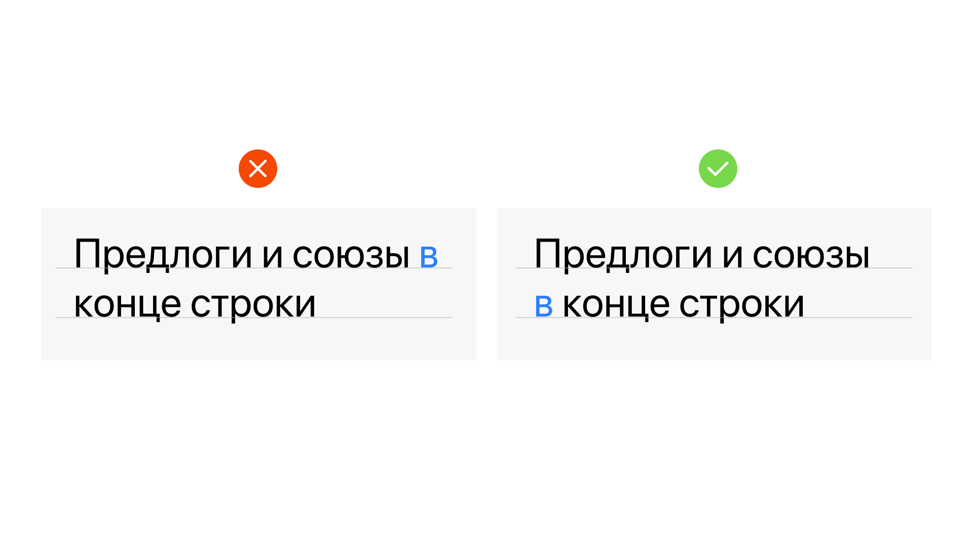
Orphaned prepositions. Don't leave prepositions or conjunctions at the end of a line. They're inseparably linked to the next word, and a line break forces the reader into an unnecessary pause.
Ellipsis. Use the dedicated typographic ellipsis character instead of three periods. It looks neater thanks to proper spacing between the dots.
Dashes and hyphens. A short hyphen is only for compound words or line breaks and is written without spaces. Use an en dash between numbers. Use an em dash with spaces on both sides for pauses and parenthetical phrases.
Quotation marks. For text in the target language, use the locale's standard quotation style consistently, with nested quotes as secondary marks when a quote appears inside another quote.

Color as a tool
Color in an email campaign works on several levels at once.
Mood. Warm tones convey calm and care. A less aggressive palette engages the reader — they don't tense up, they relax and read.
Context. The same shade changes its properties depending on the surrounding environment and neighboring colors. Test color choices under real email conditions, not just in isolated mockups.
Hierarchy. Color helps you place emphasis: make a button stand out, separate a heading from body text, mark an important block. Without a system, color turns into noise.

Learn more in our article — How Email Design Affects Conversions
How Letteros helps you build a system
In Letteros, your brand identity is fixed in a master template once: colors, fonts, spacing, heading hierarchy. Every subsequent email is built on top of it — whoever puts it together, a marketer or an intern, the style stays consistent.
The built-in typograph automatically inserts non-breaking spaces, fixes quotation marks, and removes stray characters. There's no need to set up typography separately for every email.