
Color in an email works on several levels at once: it builds brand recognition, guides the reader's eye, and affects conversion. At the same time, email is a constrained environment. A color that looks perfect in the editor can look different in Outlook or in dark theme. Let's break down how to choose a palette and avoid common problems.
How color works in an email
Color performs several functions in an email's structure.
Hierarchy. A more saturated or contrasting color grabs attention first. The call-to-action button needs to stand out against the rest of the email — color is what achieves that.
Recognition. Brand colors in the header, buttons, and accents create a visual connection to the brand. A subscriber opens the email and immediately knows who it's from, even before reading the subject line.
Mood. Warm colors create a sense of energy and urgency, cool colors a sense of calm and trust. This affects how the content and offer are perceived.
How to choose a palette
Three or four colors are enough for most campaigns.
The main brand color. Used in the header, accents, and buttons. It should match the brand color used on the website and in other materials.
A neutral background. White or very light gray for the email's background. A dark background for the entire email is rarely used — it strains the eyes and works worse in dark theme.
An accent color. For buttons, underlines, and icons. It can match the main brand color or be a contrasting complement.
Text color. Body text should be dark gray (#333333 or #222222) rather than pure black. Pure black text on a white background creates too much contrast and tires the eyes when reading.

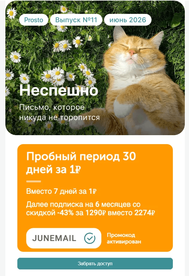
An orange price block stands out against a white background and immediately catches the eye. One accent color works better than several competing ones.
Contrast and readability
Sufficient contrast between text and background isn't just an aesthetic issue — it's also an accessibility one. Weak contrast makes text unreadable for people with vision impairments.
The minimum contrast ratio under the WCAG standard is 4.5:1 for regular text and 3:1 for large headings. You can check contrast using the Contrast Checker tool — enter the text and background colors and get the ratio.
The most common contrast problems: light gray text on a white background, white text on a light blue background, yellow text on a white background.
Color in dark theme
Dark theme is the biggest challenge when working with color in email. Email clients handle colors differently when dark mode is turned on.
What happens to colors. Gmail on Android inverts dark text on a light background — white text turns dark, light backgrounds turn dark. Apple Mail applies its own algorithms. Outlook only inverts certain elements.
What this means in practice. A dark-colored logo on a transparent background will become invisible in dark theme. Light text on a light background written in inline styles can become unreadable after inversion.
How to protect against this. Prepare two versions of your logo — dark and light. Use the CSS prefers-color-scheme media query to control colors in dark theme. Check the email in dark mode using the preview in the editor.

A Yandex Ads email with a dark background and colorful program cards. The contrast between the dark background and bright blocks creates a clear hierarchy.
The email and container background colors
An email usually has two layers of background: the background of the whole page and the background of the content container.
The page background is what's visible on the sides of the email in the client. It's usually light gray (#f4f4f4 or #f0f0f0). It creates a frame and visually sets the email apart.
The container background is the actual area with the content. Most often white.
Some email clients ignore the page background and show their own instead — keep this in mind when testing.

Timeweb Cloud uses its brand blue only in the header — the rest of the email is white. One colored block creates recognition without overwhelming the design.
Button color
The call-to-action button is the most important element from a conversion standpoint. Its color needs to stand out against the email and be noticeable.
A few rules.
The button needs to contrast with the background of the section it's in. If the background is white, a blue or green button works well. If the background is already blue, make the button white or a contrasting color.
Use one button color throughout the email. If there are several buttons, they should be the same color — otherwise the hierarchy falls apart.
Check the button in Outlook. If the button is built with CSS background-color on an <a> tag, Outlook won't display it. Use bulletproof buttons based on tables or VML.
Common color mistakes
Too many colors. More than four or five colors in one email create visual chaos. Every additional color should serve a specific purpose.
Text color in inline styles conflicts with dark theme. If you write color: #000000 in an inline style, the email client won't be able to automatically change that color in dark theme — black text on a dark background becomes unreadable.
The brand color isn't adapted for screens. A color looks different in print (CMYK) than it does on screen (RGB). Make sure you have the correct HEX code for your brand color for screen use.
Button contrast hasn't been checked. White text on a yellow button is a classic example of bad contrast — it looks bright but unreadable.
The bottom line
Three or four colors are enough for most campaigns: your main brand color, a neutral background, an accent for buttons, and dark gray for text. The key is to check contrast, test dark theme, and make sure the button works in Outlook.
Read also: