
We show how emails "break" and explain how to avoid it at the coding stage.
Responsiveness is an email's ability to adapt to screen width across different devices, including mobile. It means images stay the right size, text remains readable, and there's no scroll bar getting in the way. |
|---|
Building responsive emails matters if you don't want to lose the reader's attention — and, along with it, a potential purchase.
In a "broken" email, it's hard for the customer to tap buttons or read the text. And a product that's supposed to be shown in its best light can lose its appeal — or disappear from view entirely, drifting off the edge of the screen.
Principles of responsive email coding
For websites, we use block-based layouts. For emails, it's table-based: elements are arranged in rows and cells using the HTML tr and td tags, with the align attribute handling alignment. We write styles inline within tags and work with fluid layouts and media queries — not separately, but together, combining both approaches. |
|---|
Beginner email coders often forget about tables and use block-based layouts instead. As a result, the layout falls apart and the email displays incorrectly.
This happens because most email clients don't recognize external stylesheets. So if you write your styles separately and then link them to your blocks, the email will simply break at one of the key points.
It's also important to remember that half of all email clients don't support media queries.
The clients below don't work with stylesheets and strip media queries out of the markup — you can't write them inline either.
Gmail App | Mail.ru App | Yandex App |
|---|---|---|
Mailbox App | Yahoo App | Windows Phone |
To solve this problem, combine fluid layout with media queries. That way, emails won't shrink down to unreadable, and images won't spill outside the viewport — even in email clients that don't support media queries.
What breaks most often, and how to fix it
Let's go through the blocks that break most often in emails and need special attention.
Making email blocks responsive
In responsive coding, newsletter elements automatically stack on top of each other on a mobile screen.
Two stacking blocks are simply two div blocks with the display property set to inline. This makes the element render as an inline block.
Inline blocks take up the full width of their container. If the email is 600px wide, two identical containers will each be 300px. Here's an example of the HTML code:
<table width="100%" border="0" cellspacing="0" cellpadding="0"><tr><td align="center" valign="top" style="font-size: 0px;"><!--Item --><div style="display: inline-block;vertical-align:top;width:300px;"><table width="100%" border="0" cellspacing="0" cellpadding="0"style="border-collapse:collapse;"><tr><td align="center" valign="middle" style="font-size: 14px;"><table width="100%" border="0" cellspacing="0" cellpadding="0"><tr><td align="center" valign="top">контент</td></tr></table></td></tr></table></div><!-- Item END--><!--[if (gte mso 9)|(IE)]></td><td valign="top" style="width: 300px;"><![endif]--><!-- Item --><div style="display: inline-block;vertical-align:top;width:300px;"><table width="100%" border="0" cellspacing="0" cellpadding="0"style="border-collapse:collapse;"><tr><td align="center" valign="middle" style="font-size: 14px;"><table width="100%" border="0" cellspacing="0" cellpadding="0"><tr><td align="center" valign="top">контент</td></tr></table></td></tr></table></div><!-- Item END--></td></tr></table>
Note the value of the width attribute, which sets the table's width in the table tag. We zero out cellpadding and cellspacing, and set td align to center.
Another important detail: the border-collapse property in the style attribute is set to collapse — this is needed so all adjacent borders look like a single line. That effect matters quite a bit for how the email displays across different device screens.
The code for our email's first block ends with a conditional comment for Outlook, so it sees the closing td tag in the first container.
The second block will be almost identical, and here too we use a conditional comment for Outlook. Here's what the table will look like.
content | content |
|---|
And if the screen narrows even by a pixel, the blocks in the email will restructure themselves automatically.
content |
|---|
content |
If you want to set different widths for the cells, we recommend using this code:
<table width="100%" border="0" cellspacing="0" cellpadding="0"><tr><td align="center" valign="top" style="font‑size: 0px;"><!-- Item --><div style="display: inline‑block;vertical‑align:top;max‑width:400px;width:100%"><table width="100%" border="0" cellspacing="0" cellpadding="0" style="border‑collapse:collapse;"><tr><td align="center" valign="middle" style="font‑size: 14px;"><table width="100%" border="0" cellspacing="0" cellpadding="0"><tr><td align="center" valign="top">контент</td></tr></table></td></tr></table></div><!-- Item END--><!--[if (gte mso 9)|(IE)]></td><td valign="top" style="width: 200px;"><![endif]--><!-- Item --><div style="display:inline‑block;vertical‑align:top; width:200px"><table width="100%" border="0" cellspacing="0" cellpadding="0" style="border‑collapse:collapse;"><tr><td align="center" valign="middle" style="font‑size: 14px;"><table width="100%" border="0" cellspacing="0" cellpadding="0"><tr><td align="center" valign="top">контент</td></tr></table></td></tr></table></div><!-- Item END--></td></tr></table>
Now our table looks like this by default:
content | content |
|---|
And when the email arrives on a smartphone, it will look like this:
content |
|---|
content |
The "two columns to one" email layout principle
A two-column template lets you show more content at the top of the message on desktop. But when switching to the mobile version, that advantage disappears and display problems take its place. However, you can adapt the two columns by turning them into one.
This popular principle pairs perfectly with responsive coding. Choosing a two-column template isn't just a good option for laying out an article on a website — it also works for optimizing a newsletter across different web interfaces, including mobile screens. Fortunately, there are tools for building a responsive email template without lengthy CSS media queries.
As is well known, when coding emails it's better to avoid CSS and favor HTML wherever possible. Email clients behave differently with CSS and vary in how much of it they support. With standard HTML, though, we get a much more predictable result.
For example, attributes like align="left" and cellpadding="10" are far more reliable than their CSS equivalents, float: left; or padding: 10px;. These are the attributes to rely on if you plan to code an email using the "two columns to one" principle.
Adapting images
Let's jump straight to an example. A non-responsive banner just shrinks proportionally to the smartphone screen. Reading the text on an image like that becomes impossible, and all the key ideas in the headlines instantly lose their impact. It's a shame when all the work put into an email gets undone and the results just don't look good.

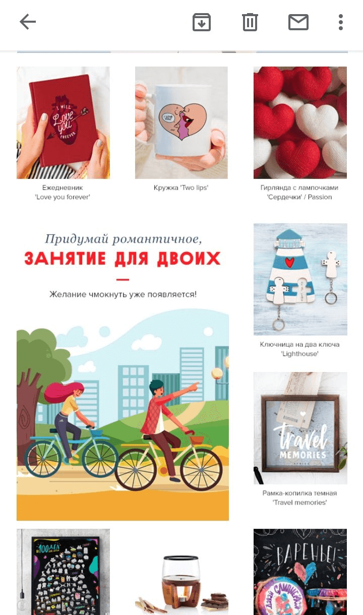
Here's an example email from PichShop. The email's blocks simply shrank in the mobile version, and the text below the images became almost unreadable due to the clutter crammed into one screen.
Let's cover how to code images into an email
A simple rule applies here: for any image wider than 300px, it's better not to set a fixed height.
When the height isn't set in the code, the system calculates it automatically, proportional to the image's size.
If your image is larger than 300px, in the styles we set the width as a percentage (100%) and the img's max-width (600px), using a fluid approach:
<span style="font-family: Tahoma, Arial, Helvetica, sans-serif; font-size: 16px;color:#000000;"><img src="creative-main.png" width="600" alt="Альтернативный текст" border="0"style="display: block; width: 100%; max-width: 600px"/></span>
Desktop clients (including Outlook) will read width="600" and display the banner at 600px wide. Google reads width: 100%; max-width: 600px and will show the image at full width, but never more than 600px. This gives you image scaling that won't interfere with the rest of the email's content adapting properly.
Don't forget to add alt text.
Another important point: iOS devices can modify content for easier reading, which often ruins email authors' plans. This frequently clashes with the design and can even break the email's layout entirely. You can avoid these unpleasant consequences by adding the following to your code: html { -webkit-text-size-adjust:none; -ms-text-size-adjust: none;}
And to get rid of the common auto-scaling issues in iOS 10 and iOS 11, add this line to your code: <meta name="x-apple-disable-message-reformatting">
A couple of small tweaks in the code, and you're all set for the email to display properly regardless of the smartphone model.
Setting up buttons
Here's how we scale buttons in the mobile version so they stretch across the full screen.
<table width="100%" border="0" cellspacing="0" cellpadding="0" style="width: 100%;"><tr><td align="center" valign="middle" height="50" bgcolor="#000"style="height: 50px; display: block; background-color: #000000;"><!--[if gte mso 9]><table border="0" cellspacing="0" cellpadding="0"><tr><td nowrap align="center" valign="middle" height="50" style="padding: 0 30px;"><![endif]--><a href="#" target="_blank"style="font-family: Arial, Helvetica, sans-serif; font-size: 24px; line-height: 50px; color: #ffffff; white-space: nowrap; font-weight: normal; text-decoration: none; display: block; padding: 0 30px;">Текст кнопки</a><!--[if gte mso 9]></td></tr></table><![endif]--></td></tr></table>
Height and line-height are the same here, as are background and bgcolor. Target is set to _blank specifically so the page loads in a new browser window.
The main thing to know: the line height should match the button's height, and its text should be under 300px wide. If it's wider than that, the text will break the responsive layout or spill outside the button.
Remember that buttons in emails should vary
Isn't it convenient when a recipient can call a listed phone number straight from the email, without copying it? It noticeably shortens the distance between the customer and the company.
Buttons like this increase the chances that a customer will reach out for the service while their impression of the offer is still fresh. A "Call" button gives them an instant, simple action — bringing them closer to what they want in seconds, without extra hassle.
That said, a "Call" button only makes sense in the mobile version and isn't needed when the email is viewed on a computer. So it's better to create two buttons: one with a call action for smartphones, and another for desktop. For the desktop version, invite people to follow a link and change the CTA to something like "View," "Go to website," and so on.
Adapting an email for dark mode
Oh, the paaain, the paaain 🙂 Coders often forget that a user might have the app's dark theme turned on.
And then the text simply disappears into the background, and the recipient misses part of the email's content. Like this:

If the background is built as an image, the text color gets inverted, which can affect its readability. Some clients do a straight "white to black" inversion, while others pick a dark equivalent instead.
Important: different email clients handle dark mode differently, so the result will vary.
Here's what your responsive email markup needs to look like for the styling to invert correctly:
1. Tell the email client that your emails support dark mode. Add meta tags to the <head> tag in your HTML code:
<meta name="color-scheme" content="light dark"><meta name="supported-color-schemes" content="light dark">
2. Configure clients that support email customization. Use a media query in the <head>:
@media (prefers-color-scheme: dark) { }
3. Change the font and background colors. Make dark text light, and light backgrounds dark instead:
@media (prefers-color-scheme: dark) {.copy {background-color: #222222;color: #eaeaea;}}
4. You can add one logo for light mode and another for dark mode. To do this, add two logo variants in the code and set the CSS using the class attribute, so each logo displays correctly:
<img class="light-img" src="logo-light.png" alt=""><img class="dark-img" src="logo-dark.png" alt="" style="display: none;">@media (prefers-color-scheme: dark) {.img_light { display: none !important; }.img_dark { display: block !important; }}
Some email clients let you swap images but might not swap certain colors. Keep this in mind, and always test the email before sending it for real.
A few more things
We've put together a list of useful tips worth keeping in mind if you're about to start coding emails. For professionals, relying on these principles is usually second nature, but beginners can find it hard to keep everything in mind at once.
- Table structure should be as simple as possible, and the code should be easy to read.
- Ideally, an email's code shouldn't exceed 100 KB — otherwise, some web interfaces might clip it, and it won't look its best. Gmail, for example.
- Instead of merging cells (colspan, rowspan), it's better to use nested tables in emails.
- Add both horizontal and vertical alignment. They need to be set explicitly, since default values can vary across email clients.
- The same applies to spacing. Horizontal spacing is best done with an empty cell containing a non-breaking space; for left and right margins, create smaller nested tables.
- Don't forget to zero out the cellpadding, cellspacing, and border attributes on your tables.
- If a table's height exceeds 1800 pixels, Outlook can produce page "breaks." These look like empty gaps splitting apart a table or image.
- Don't overdo it with spacing between nested elements, line breaks, or stretching blocks vertically. Ideally, the height of a logical block in an email should equal the height of one screen.
Once you've coded the email, you'll need to check the size of the resulting HTML file. If it's too big, try shrinking it — one method that helps is removing tab characters, line breaks, and comments.
Can you make emails responsive without writing code?
You can! Just use the Letteros email builder — it'll take care of the work for you. Simply pick a suitable email template and watch how great your emails look across devices thanks to responsive coding, all without wasting extra time.
Letteros is a modular editor that lets you build an email template layout without a specialist coder or any knowledge of HTML.
The platform shows how your email will look on 100+ smartphones, and built-in tools instantly check the email for errors.
The result: your newsletter looks great both on desktop and in mobile mail clients. Right in Letteros, you can also translate text into any other language, automatically pull in a preview for a video in the email, and quickly rearrange blocks.
Check out the demo and switch to Letteros. Creating an email here takes just 15–20 minutes.
By the way, if needed, we'll help you migrate your email templates into the builder for free. And our support team is always available to help you get the most out of Letteros.