
Most teams put off sending campaigns because the designer is busy. Or they don't bother making emails look professional because they assume it won't look good without a designer and a developer.
We're confident it can. There are six rules that deliver a quality result without a professional designer or extra budget.
Rule 1. Hierarchy — the main thing first
The email's headline answers one question: why should I read this. Then comes the substance and details.
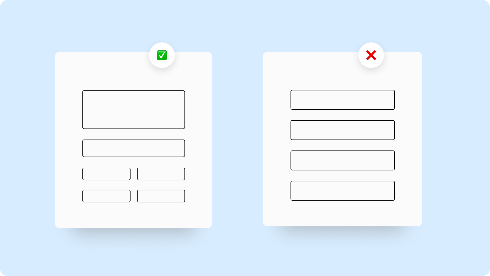
Visual hierarchy is the order in which a person processes information based on its importance. The brighter and larger an element, the higher its priority. The reader's eye moves in a line from the largest element to the smallest.
It's easy to check: blur the email in the editor, or squint at it. What stands out first? That's your visual priority. If the wrong thing stands out, the structure is working against you.

Rule 2. One goal
One email — one main idea — one call to action.
This rule gets broken most often. A marketer wants to announce a promotion, promote a webinar, and remind people about the blog — all in one email. In the end, the reader doesn't understand what's being asked of them and does nothing.
If there are several goals, send several emails. Or send one with a main call to action and secondary links that don't compete with the primary button.
Rule 3. Typography without experiments
No more than three font sizes per email. Only web-safe fonts: Arial, Georgia, Tahoma, Verdana. If you use others, the recipient's client will automatically substitute a font and the layout will shift.
Three text levels are enough:
Level | Size | Purpose |
|---|---|---|
Heading | 24–32 px | The email's main idea |
Subheading | 18–20 px | Sections and blocks |
Body text | 14–16 px | Everything else |
This is enough for any email — from a promo to a transactional notification.
Rule 4. Breathing room
Spacing and white space are your main design tool when you don't have a designer. The more room around an element, the more attention it draws.
Don't be afraid of empty space. An email where the blocks can breathe looks professional even without elaborate graphics. An email where the blocks are packed tight looks cluttered even with beautiful illustrations.
The minimum spacing between blocks is 24 pixels. Inner padding within a block should be at least 16 pixels on every side.

Rule 5. Color by the 60-30-10 rule
One accent color from your brand book. Everything else neutral.
The 60–30–10 rule:
- 60% — the main background (white or light gray)
- 30% — a supporting color (a light shade of your brand color)
- 10% — the accent (buttons, highlights, icons)
Bright colors stand out more than muted ones. Color is a powerful tool for setting priorities. If everything is equally bright, nothing stands out.
One accent color per email isn't a limitation — it's a tool. A button stands out because it's the only thing in the accent color. If five other elements share that accent color, the button gets lost among them.
Rule 6. Mobile version and dark theme
30–40% of readers open emails on their phone. Always check the email on mobile — before every send.
Two things that break most often:
Buttons. On mobile, buttons get tapped with a finger. The minimum height is 44 pixels. Buttons that look fine on desktop often turn out too small on a phone.
Dark theme. A significant share of iPhone and Android users have dark mode turned on. Text and buttons need to be readable in both modes. Use sufficient contrast — especially for text on a colored background.

How all six rules connect
These rules work together, not in isolation. Correct hierarchy is useless if color draws attention to the wrong place. Good typography won't save an email that has no breathing room. A beautiful desktop email falls apart on mobile without testing.
A quick check before sending: where does the eye go in the first second? It should land on your main idea. If it doesn't, revisit your hierarchy.
Rule | What to check |
|---|---|
Hierarchy | The main point stands out larger and brighter than everything else |
One goal | The email has one button with the main action |
Typography | No more than three font sizes, all web-safe |
Breathing room | There's spacing between blocks, the email isn't cluttered |
Color | The accent color is used only for buttons and key elements |
Mobile | The email has been checked on a phone and in dark theme |
How Letteros helps you follow these rules
In Letteros, the master template locks in all six rules in advance: font hierarchy, color system, spacing. A marketer builds the email from ready-made blocks, and the markup stays professional without manually adjusting every element.
Responsiveness is built in by default: the email displays correctly on mobile and in dark theme with no extra work.